Transitional Ambience House
PINS Studio Architecture & Interiors were engaged by a family of four to design a clean and contemporary space in the realization of the Transitional Ambience House in Selangor, Malaysia.
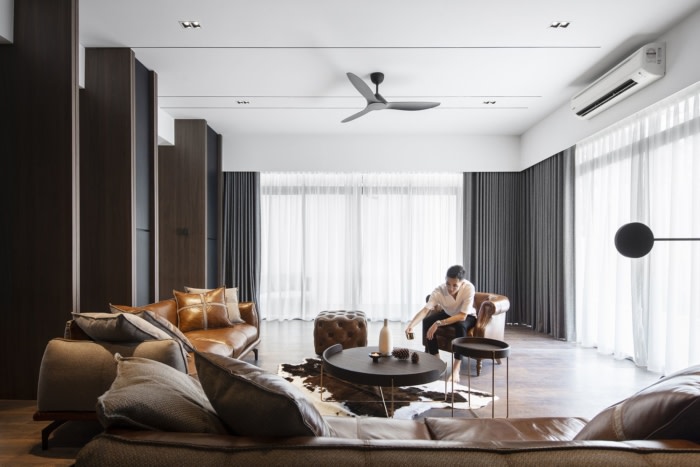
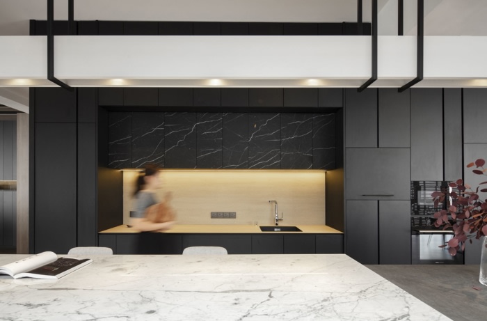
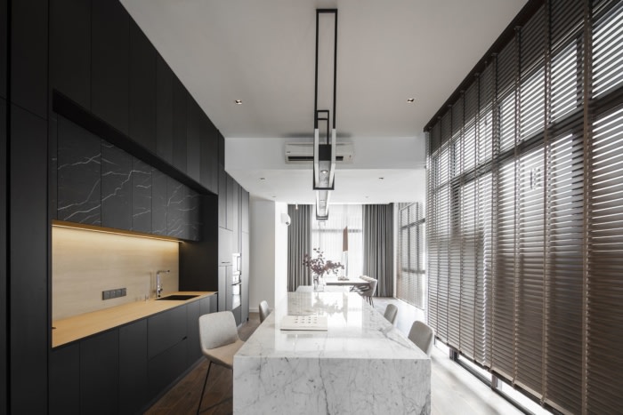
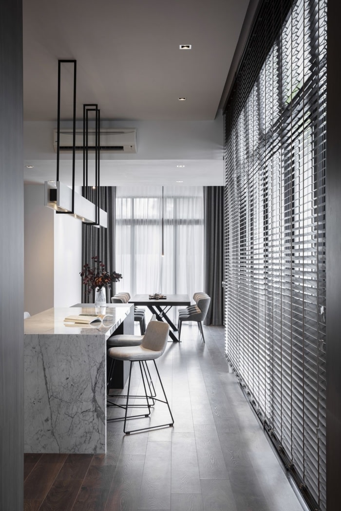
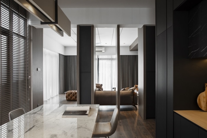
To meet these requirements, our first approach was to open up the spaces on the Ground Floor to accommodate the main living spaces which comprise the living hall, dining area, dry kitchen and the wet kitchen. As this house is set over a long and narrow layout, these spaces were aligned against a central axis to bring in a sense of fluidity and spaciousness. Solid walls were eliminated where possible; however, to visually divide the living area and the dry kitchen, semi-open display panels were employed so that a streamlined outcome could be achieved to complement the linear configuration of the furniture pieces that landmark each of the different spaces.
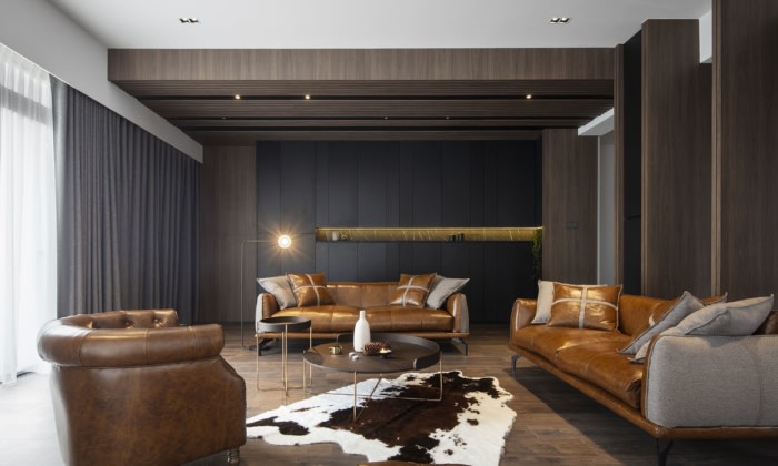
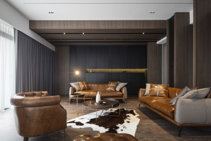
Towards the front, the living hall is enveloped by custom-designed floor-to-ceiling windows and sliding doors. A strong palette of dark wood and sophisticated accents evoke a touch of formality in this space, but softer textures engender a personal and cosy home environment. The doors slide open to reveal a cosy terrace, creating an indoor-outdoor atmosphere while ensuring the living area receives optimal natural light and air. On the opposite end, the wet kitchen which leads directly to the yard, storeroom and powder room is tucked to the rear side of the home to keep the utilitarian function of those spaces segregated from the living spaces.
What stands out in this house is not immediately apparent as it is more about how the spaces feel. The graceful way the spaces flow is anchored by the design team’s intention to create a transitional experience when moving from one room to another. This is prevalent when one walks from the living area to the dry kitchen and subsequently to the dining area. A different ambience ensues at each of these spaces, albeit being set in an open plan manner. While it was not an easy feat, the designers accomplished this unique spatial effect using a gradient approach where strategic applications of dark tones elevate into lighter hues and polished surfaces throughout the home. The key to ensuring they appear in a balanced manner is the designers meticulous manoeuvre of contrasts that also take into account the use of daylight.
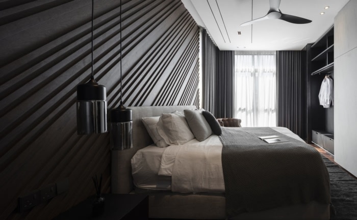
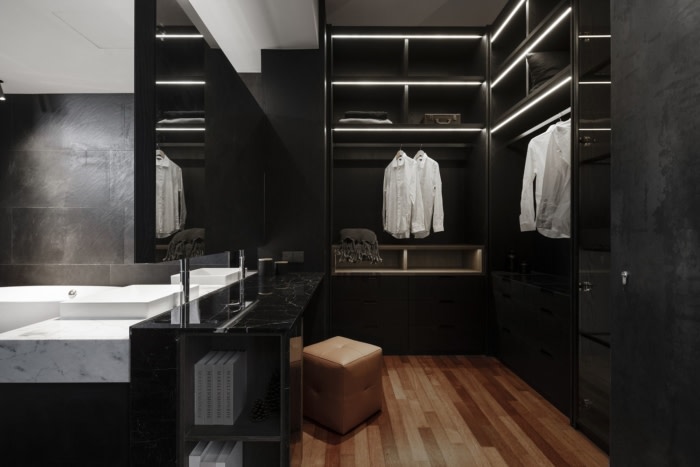
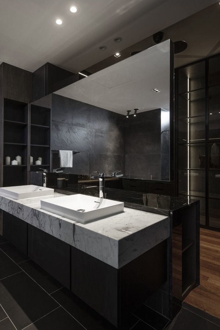
On the First Floor, three bedrooms pivot around a family hall. In the master bedroom, a dark, masculine theme highlights the space, echoing the palette of dark wood tones in the main living areas. While the owners wanted a walk-in wardrobe, it was not ideal as the existing space between the ensuite bathroom and the bedroom was very tight. To resolve this, the design team took down the adjacent walls to create an open-concept bathroom. This made way for a walk-in wardrobe that is separated from the bathroom by a solid black glass which contrasts with the sleek white countertop of the washbasin area, once again bringing in the gradient approach that was used dominantly on the Ground Floor.
The main challenge was deciding how to bring a different experience, how the tone of colours changes from one space to another. We are glad we went for it as the interplay of different materials and tonal values have resulted in a strong design outcome.
Design: PINS Studio Architecture & Interiors
Photography: Pixelaw Photography

