Santo Tirso House
Hous3 designed the Santo Tirso House to encompass both the elements of a traditional Portuguese home and a bright and modern dwelling fit for 21st century living.
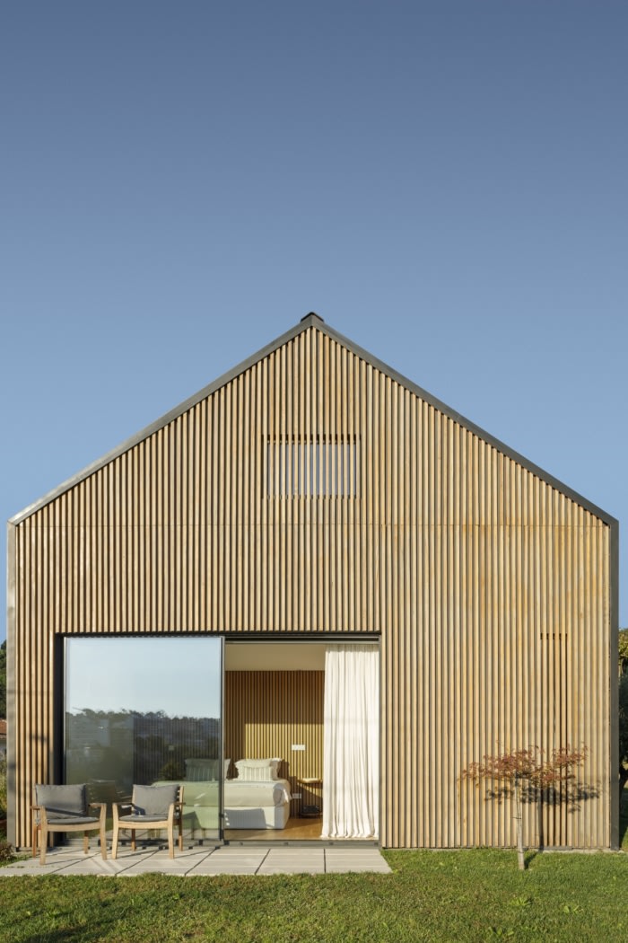
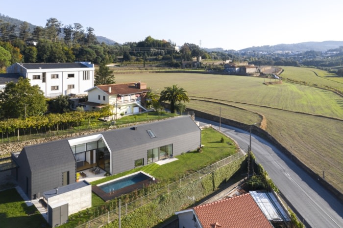
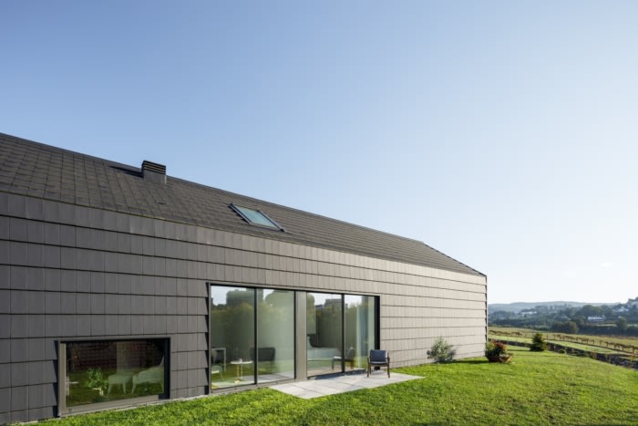
From the road you can see the house, on a small hill, with a dark silhouette in sharp contrast to its natural environment, offering a wide view over Santo Tirso. Its simple lines are the reinterpretation of the stereotype of the traditional Portuguese house, gable roof.
We started by defining a northeast-southeast axis in the longitudinal direction of the land and oriented in the best view of the place. And in this linear orientation, the main volume is arranged, in a playful reconfiguration of the traditional house, it becomes remarkable in the landscape. A smaller, fat volume is attached to this one, which in addition to completing the programmatic requirements of housing is also an allusion to the annexes that traditionally are constant additions
to the main house.
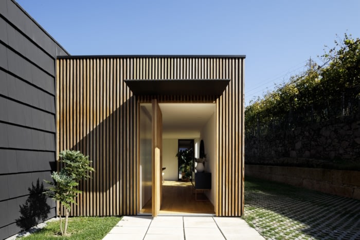
This volume departs from the entrance of the lot to create a kind of external decompression atrium. And in the simplicity of the composition of these two volumes, an intuitive understanding of spaces is promoted, inviting us to enter.
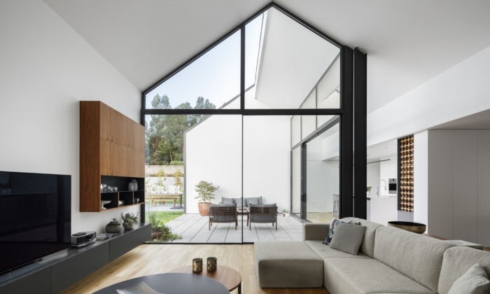
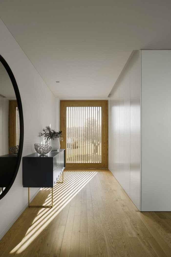
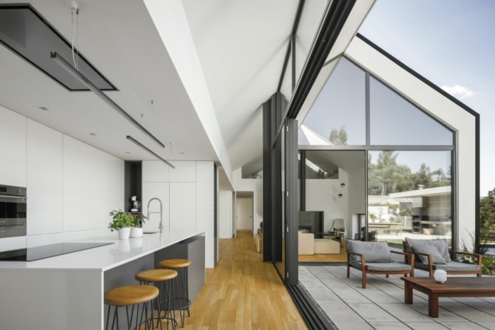
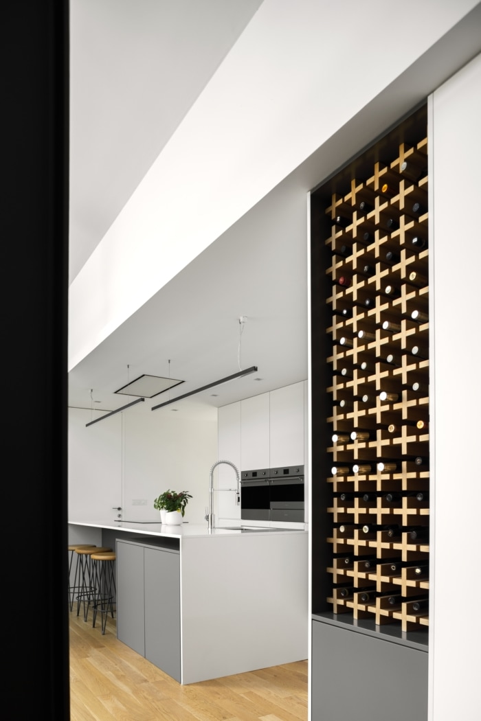
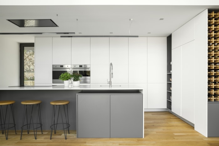
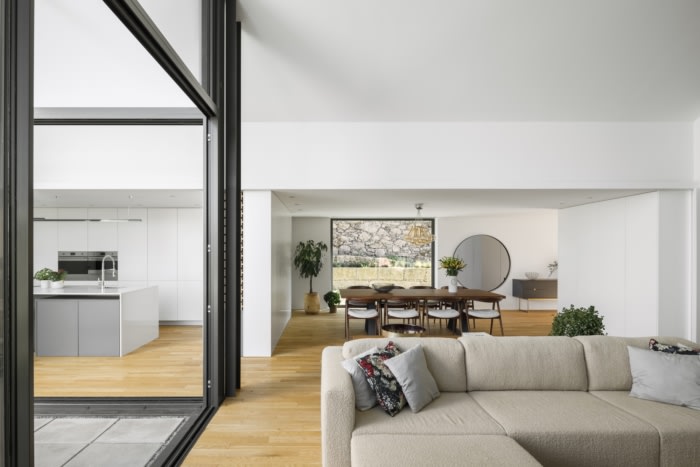
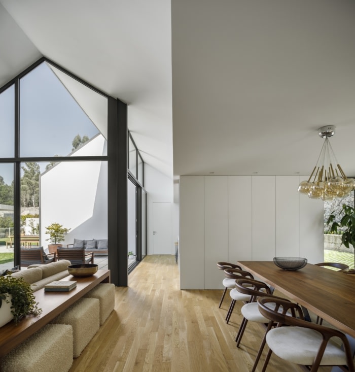
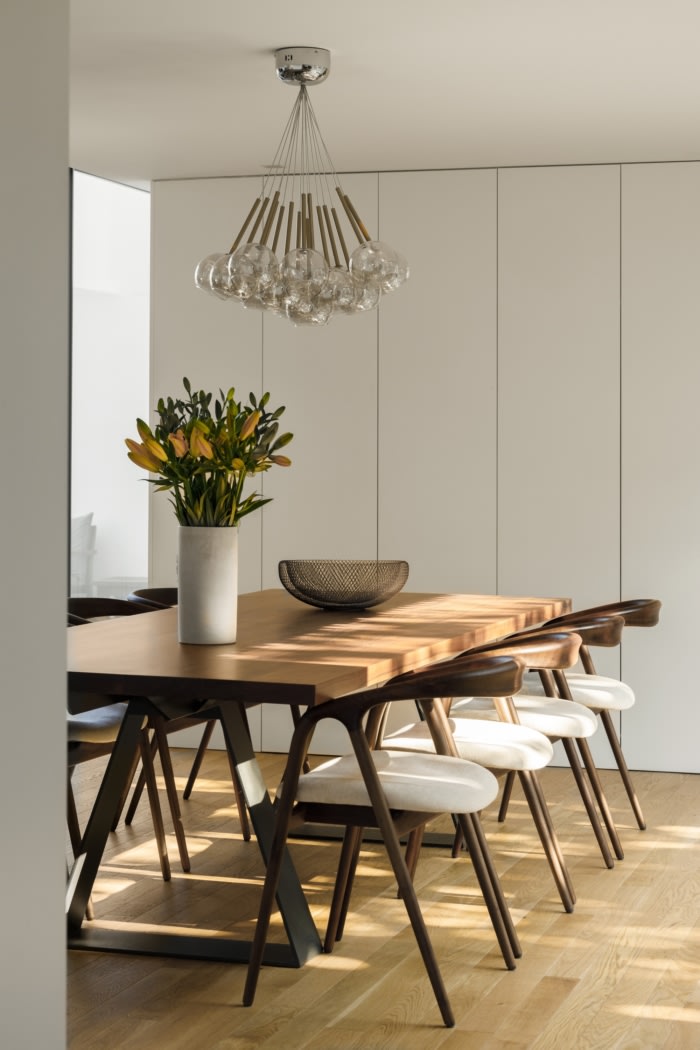
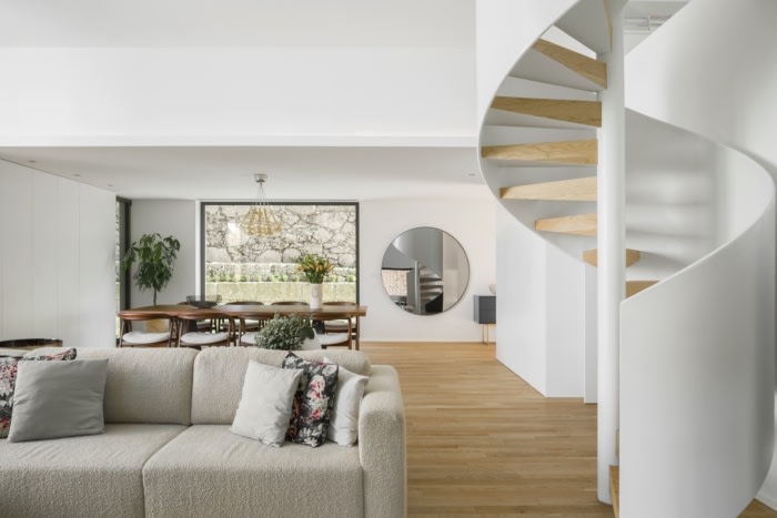
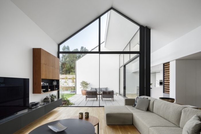
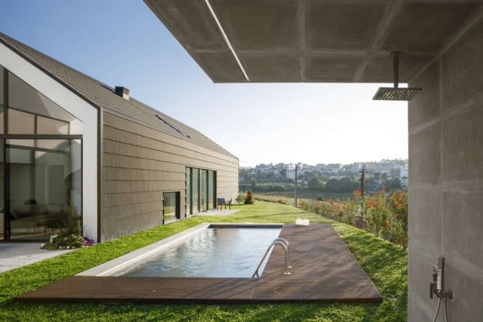
In terms of the program’s distribution, the reception lobby is the frst point of contact with the house, leading us to the central and common areas of the house: dining room, living room and kitchen, spacious and generous with lots of natural light promoted by negative space, which is used as the extension of the indoor room to the outside, to the pool and outdoor dining room, taking advantage of the rhythmic play of light in the afternoon.
This central block also allows us to separate two spaces that were to be independent:
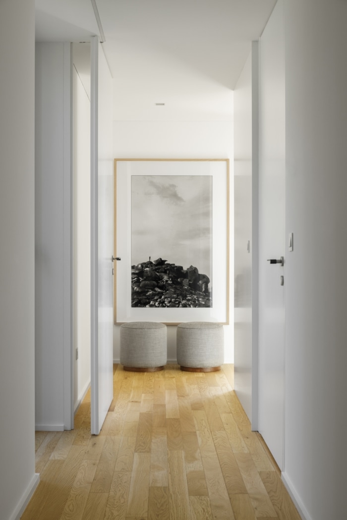
For the south-east, the private area, a corridor distributes the rooms and a small office, all of them with exterior spaces accessible through glass doors that balance the visual and physical connections to the landscape of each room;
To the northeast, the technical areas of housing and work, with double height;
Over these two areas, the traditional shape of the gable roof allowed the interior spaces to be modeled to complement the nature of the programs, creating a place for reading and studying.
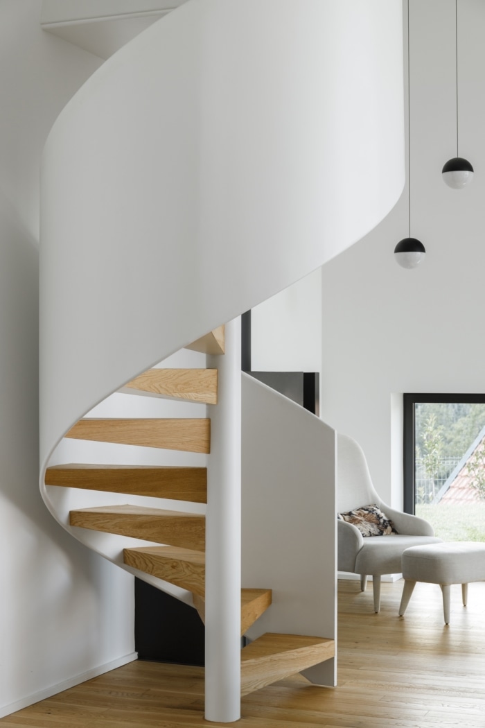
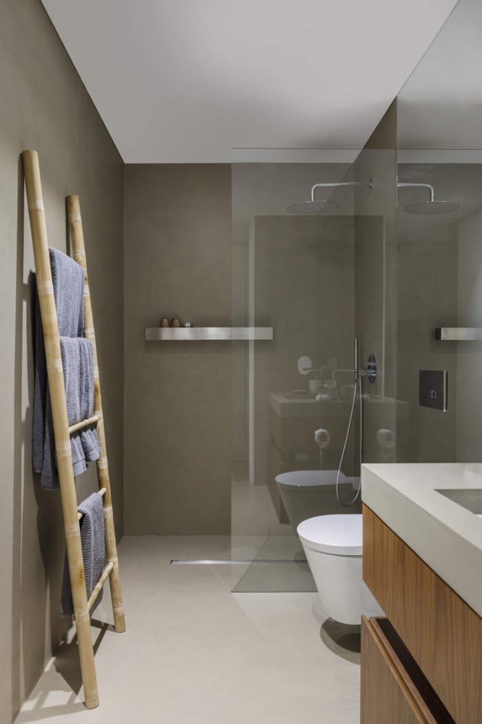
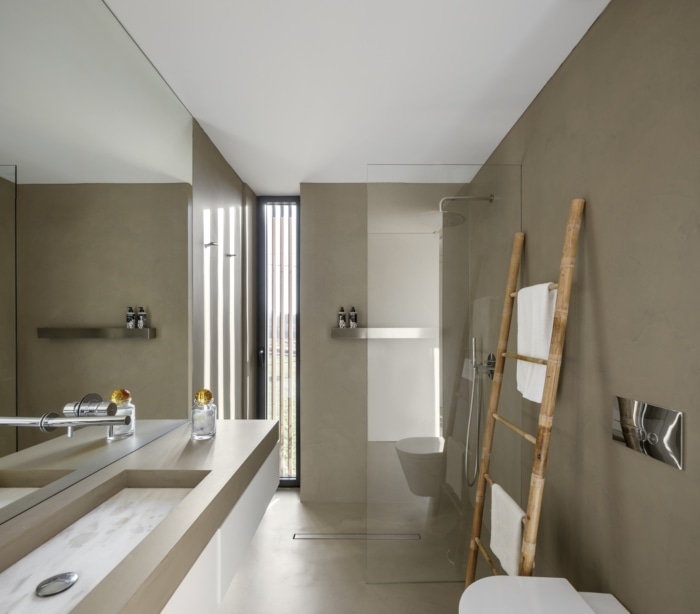
Due to the simplicity and relevance of its interior design, with light, minimalist and smooth walls, it offers a peaceful living space. In contrast to the dark exterior, where the black plant tile and the pine together with the simple shape of the building create a striking graphic silhouette against the landscape.
On the whole, through the juxtaposition of its facade materials, we get closer to the natural, the beautiful, where we hope that its inhabitants are happy.
Design: Hous3
Photography: Ivo Tavares

