The Angel Empire House
YoDezeen architects created a mind-bending and airy interior for a venture investor, a beauty connoisseur; a Moscow dwelling where the sky is only one-step away.
Every time unexpected and new, this time the light interior by YODEZEEN became truly special. Cold air shades, impenetrable darkness geometry, and the charm of a woman. The Angel’s Empire is about our sight of the heavens and how we build them.
The last two floors of a high-rise building are convolved with aromas, tastes, gleaming. This is one of the lightest interiors the studio has ever done for a man. Apartments with a total area of 338 square meters are located on two levels, creating their own little empire with its own heavenly-light and inky-dark accents. For almost a year, designers and architects have been drawing and implementing the real Angel’s Empire in the Moscow skyline.
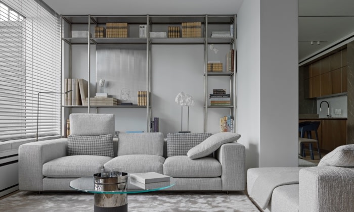
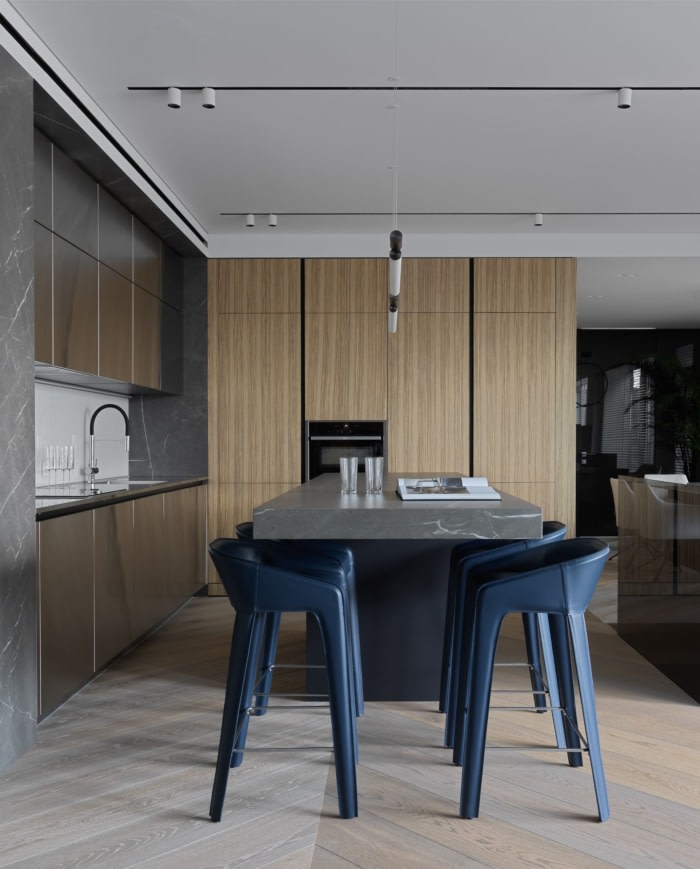
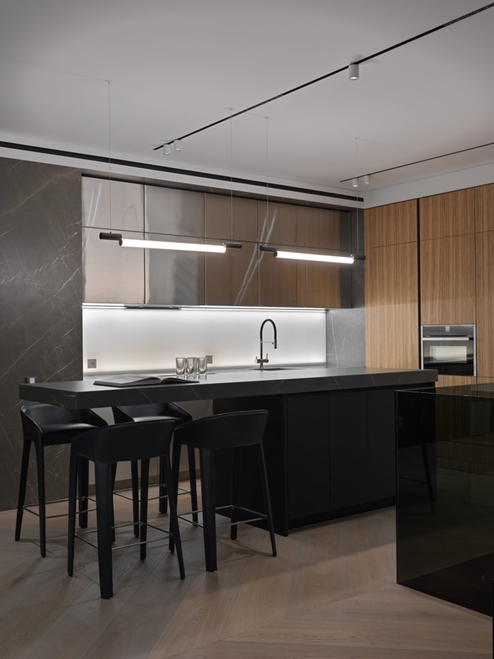
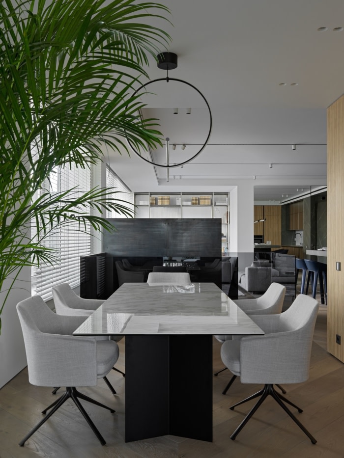
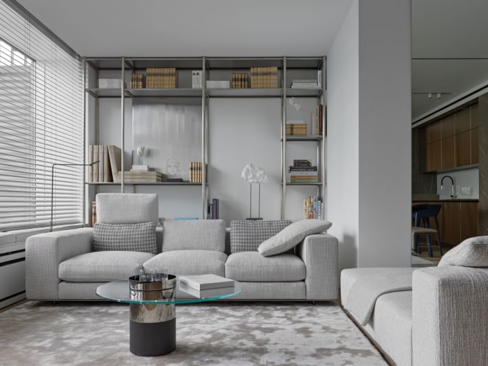
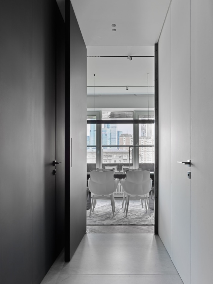
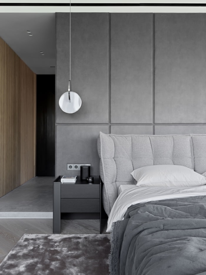
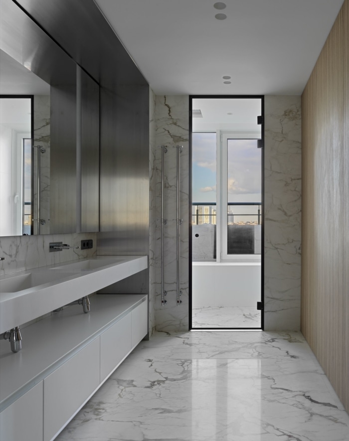
Each zone tells its own story with architectural and color schemes: the frosty gray living room and dining area softly contrast with the kitchen zone, completely flowing into the dark corner of the staircase. The master bedroom picks up the living mood, but also gently flows into the warm lighting of the bathroom. The lower floor repeats the mood of the general concept, but with the guest block, consisting of a bedroom, wardrobe, bathroom, cabinet, a laundry room, and a maid quarter.
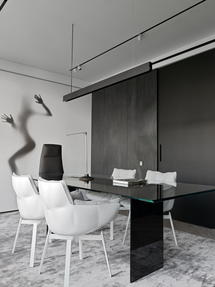
Working on this project, YODEZEEN architects and designers relied on the very art: from physical works to their embodiment literally everywhere. Certain elements, though accessories on the shelf stand in the living room, chandeliers over the dining table, and of course the shapes and curves of female silhouettes in hall and cabinet, as the layout and symbol of The Angel’s Empire.
Apartments were created for the venture investor who loves beauty in all its natural manifestations. Each zone tends to the outside world: “naked” windows, a terrace of 120 square meters, and a first-level balcony that frames the entire space.
The design concept of the apartment is concentrated in laconic forms, logical clarity, harmony, and simplicity: a steel custom kitchen with an illuminated back wall, classic shades of veneered panels, porcelain stoneware, and one of the most unusual elements — leather panels behind the bed in the guest bedroom. Everything is verified, consistent and symmetrical, without grotesque and bombast in any material.
The main feature of the project was the absolute trust of the customer, everything was agreed upon from the word go. Each client’s request and the designer’s decision were complicated, but they were received with delight from one thought of the realization.
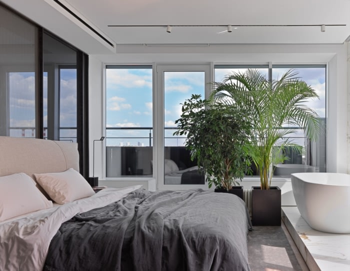
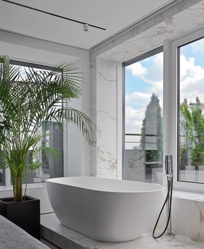
One of the main attractions of the apartment is the master bedroom unusual combination with the bathroom. You can literally reach the bathroom with your hand, and the sky is one more step. Visually, this solution makes windows even more “open”, and the entrance to the terrace is harmoniously played out. Despite the fact that the apartment is a true gallery of “celestial aesthetics”, such a bath arrangement was accepted to continue the apartment in the lines of the terrace. Porcelain stoneware boxes, steps, and lighting have become a functional decoration.
Design: YoDezeen architects
Design Team: Artur Sharf, Artem Zverev, Gleb Brizhanov, Natalia Guseva, Angela Gabruskaya
Photography: Sergey Krasyuk

