East Fremantle House
NIC BRUNSDON worked closely with their clients when designing the East Fremantle House with a contextually responsive addition to a heritage cottage in suburban Perth.
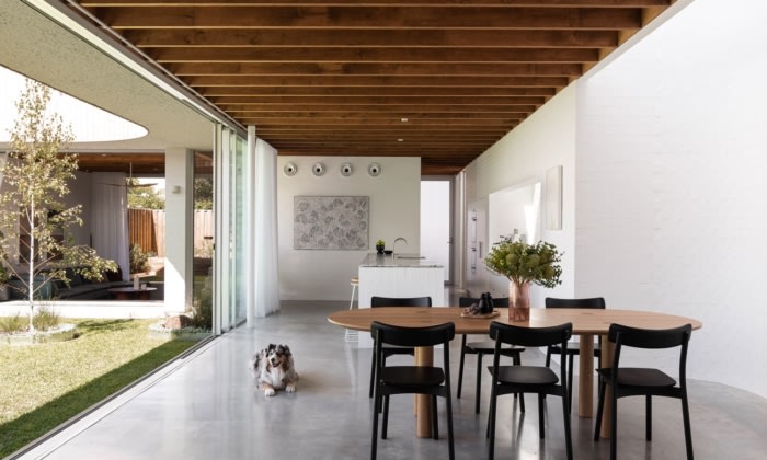
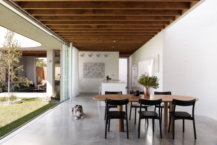
The most important part of this house is the space that is not built – specifically, a large northern void – a space for sun, light, sky, sound, and breeze to inhabit. The house then traces this edge, creating rooms with immediate connection to these elemental conditions.
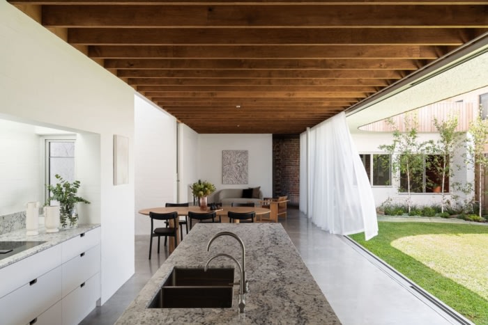
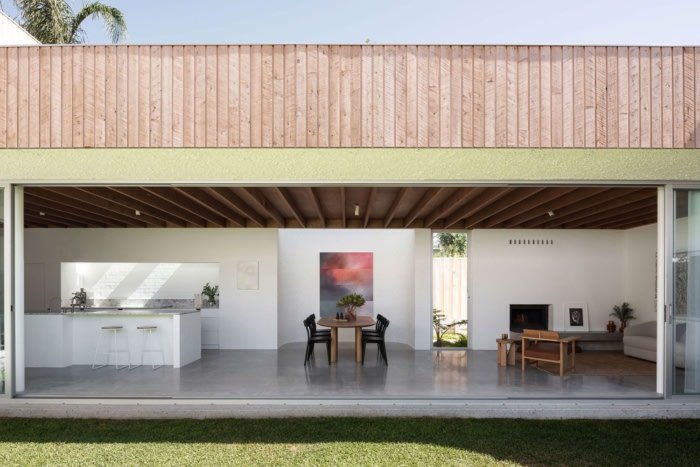
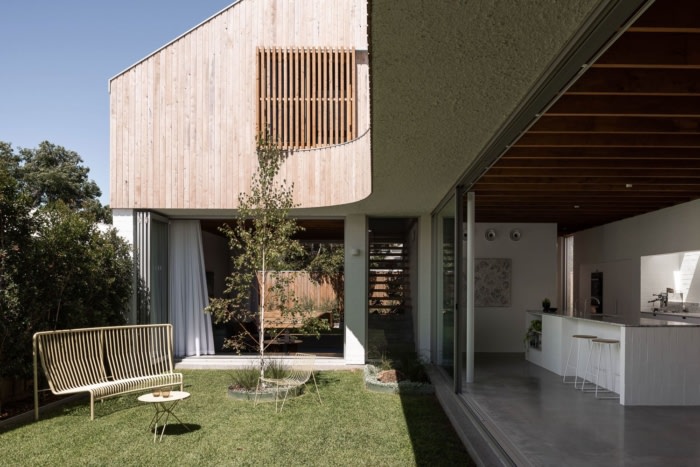
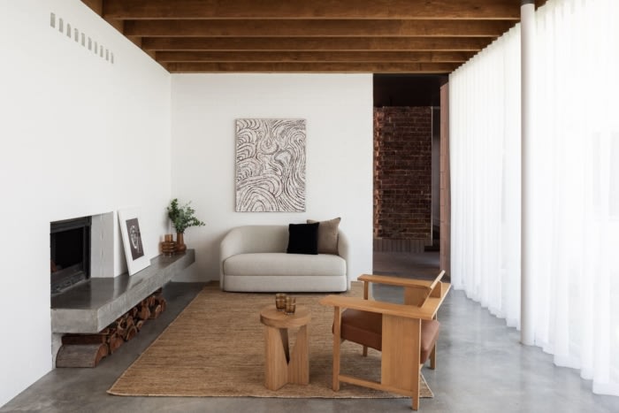
On the northern face of the addition, the form is simple and linear, allowing the southern mass of the building to be an efficient living space conceptualised as one long ‘garden room’. The northern face of these spaces is lined with sliding doors, allowing the whole space to open up and allow the life of the house to spill out and occupy the full width of the site.
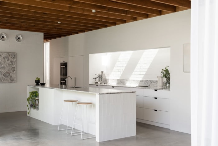
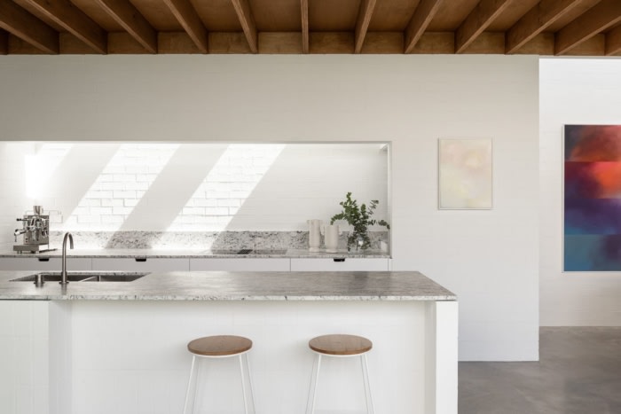
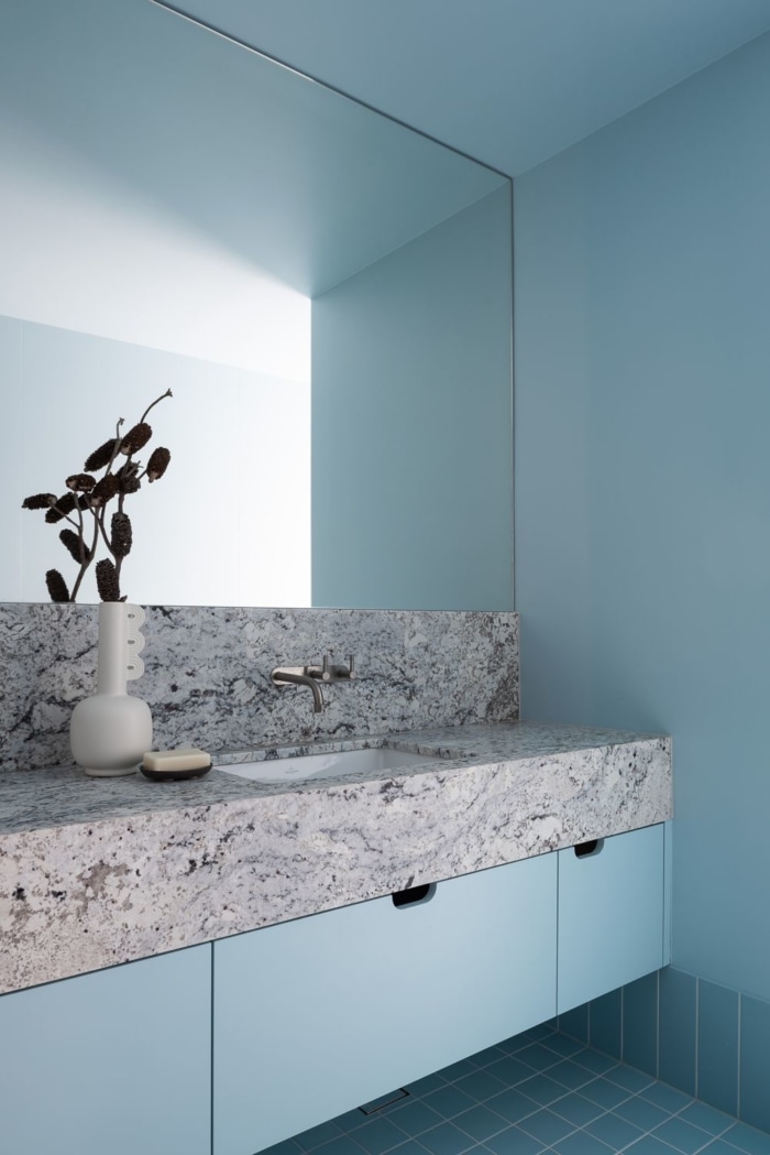
On the southern face, the ancillary program elements are expressed as ‘lumps’; a tall triangular chimney for the fireplace, a curved north facing shell for an art wall, a low top-lit box for the kitchen, and a high round cylinder for a powder room.
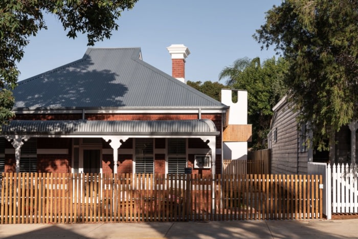
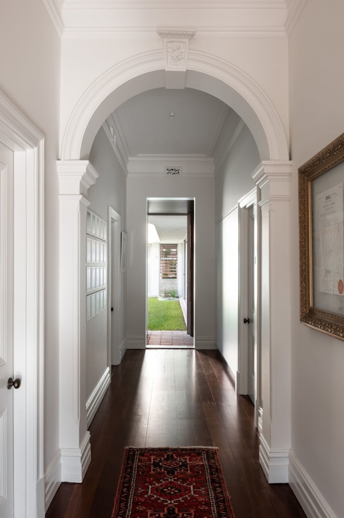
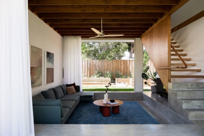
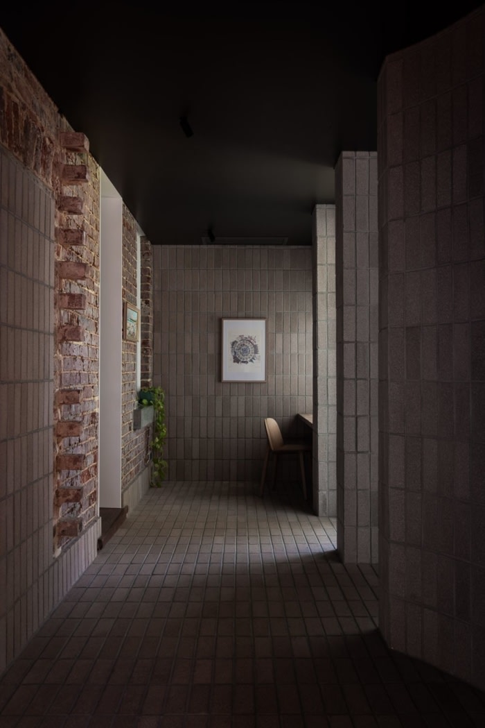
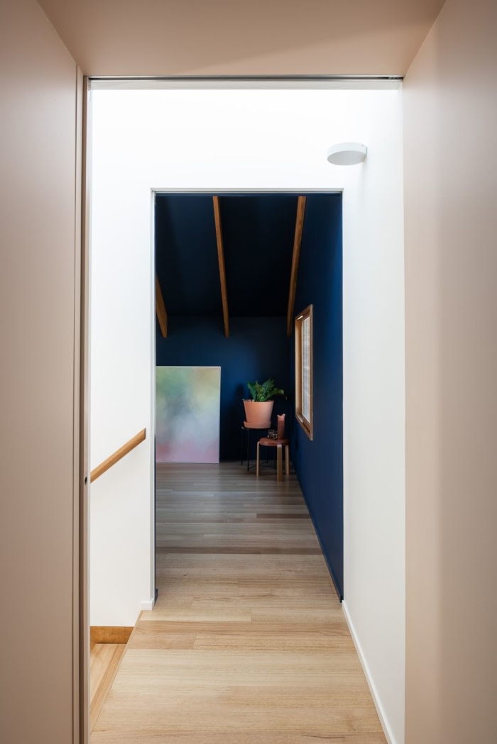
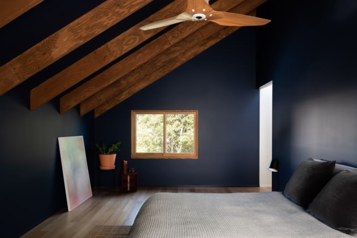
Formally, the house is expressed in four parts; the existing brick cottage, an entry link, the ground floor addition, and the first floor addition. The entry link acts as a mediating point, the connective tissue between the elements. Dark, hard and solemn. To the left upon entry is the existing cottage, restored and lightly amended. To the right, the garden room and living spaces which are, light, bright, and open, experientially a direct counter to the experience of the house upon entry. Above these sits the articulated eaves and master suite, a wooden box perched lightly.
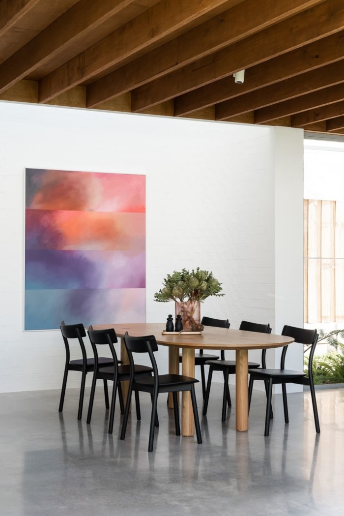
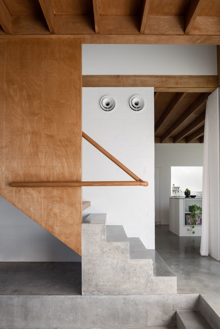
The ground floor addition is masonry construction, either painted or bagged brick, or rough thrown concrete, all painted white. This floor then hits a very deliberate and expressed datum line above which the project becomes light framed natural timbers. There are two points where this hard datum threshold is broken; once on the southern elevation where the counter ‘lumps’ break through to varying heights, and again in the sunken lounge room where the first-floor stair flicks a timber hatch down to welcome and gently touch the heavy base of the ground floor program.
This practice’s view of sustainability is that it is best done as a first principles thing and not an applied technology. Getting the massing, orientation and subsequent program planning right is the most important thing we can do as designers of lived-in environments. More so than ever in our current context of shifting work patterns towards the home.
This project demonstrates that by placing the northern garden as the first design move on site. The building then becomes secondary and deferential to this. The garden, this void of space, gives measurable and appreciable amenity to the project and shows that an understanding of and connection to our celestial sphere can shape the rhythms, patterns, and quality of daily family life.
Design: NIC BRUNSDON
Photography: Dion Robeson

