Continental Place
Hoedemaker Pfeiffer completed this downtown condominium that captures the essence of the Pacific Northwest while overlooking the beautiful city of Seattle, Washington.
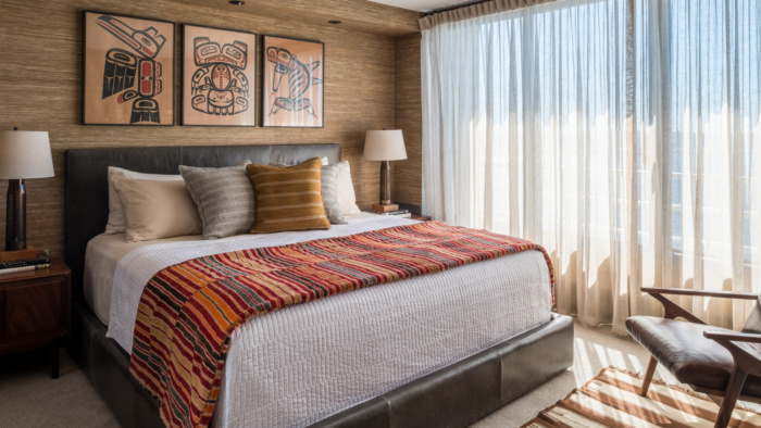
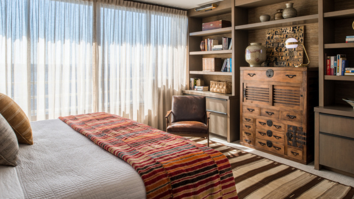
An existing apartment was stripped to the studs and reworked to create a warm and masculine urban retreat for an Alaska-based bachelor. The designers created an open plan into which was added a rich textural blend of warm woods, grey stone, and woven wall coverings. Art and furnishings were selected to reflect a strong Northwest influence, complimenting panoramic views stretching from downtown Seattle to the Olympic Peninsula. The result is a casually-eclectic home with a palpable sense of soul and history.
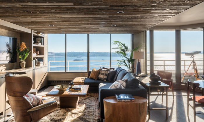
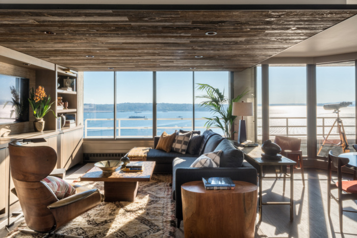
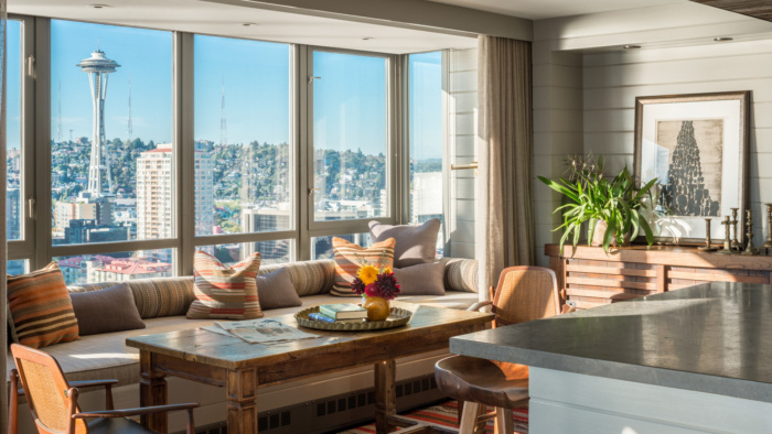
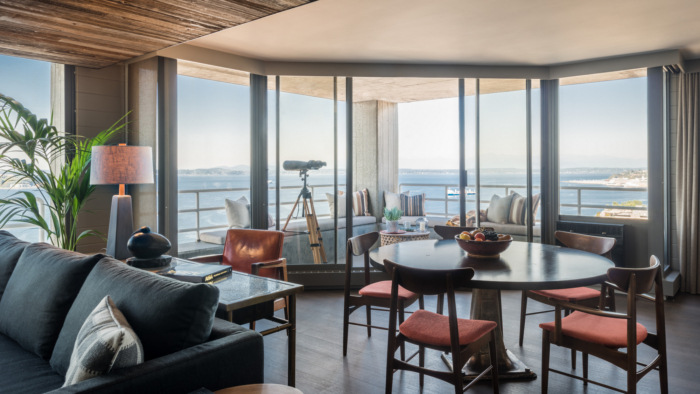
The view is the main event in the home, offering both coastal vistas and a city skyline. The client wanted an open floor plan that allowed for flexibility in terms of dining and entertaining, so warm woods with a variation on texture and color were used in order to differentiate each area from the next.
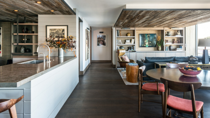
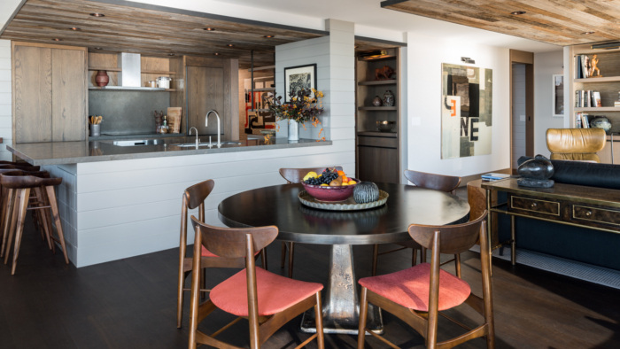
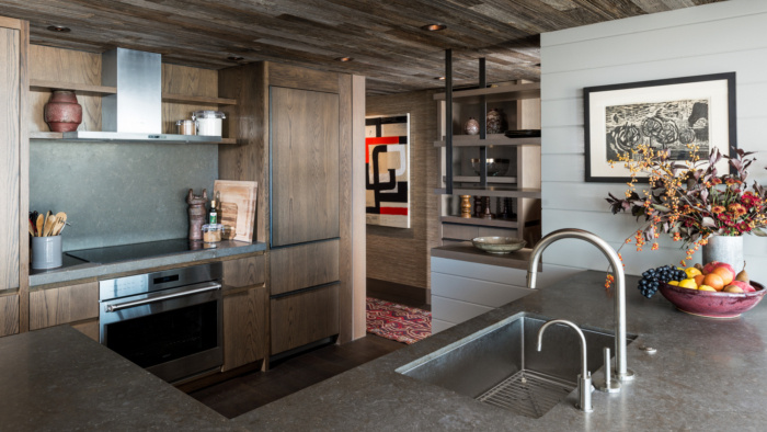
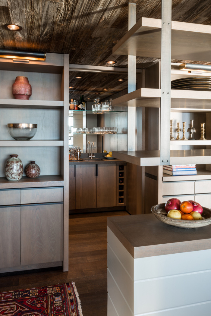
The original 1980s-era floor plan was chopped up into small spaces and included a walled-in kitchen, all blocking natural light and views. The project began by opening up the plan to allow natural light to penetrate as deeply into the apartment as possible. With a limited foot print, the new plan was designed the way one designs a boat—every space has a function with many flexing from one use to another. Fumed oak and steel casework finish and details are used throughout.
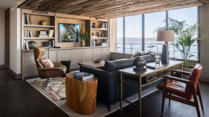
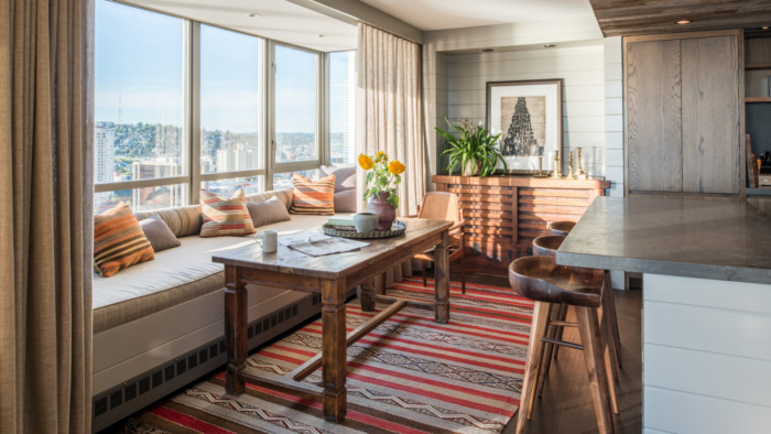
In the den, a dark, textured wood ceiling is juxtaposed with a lighter sand coffee and side table, while the furniture pieces rely on weathered leather for a lived-in feel. A textured rug adds an element of coziness. There is a decided juxtaposition of contemporary, modern, and vintage elements complementing these shared spaces. Though rustic, the 19th-century Japanese tansu, 18th-century kitchen table, and mid-century cane and leather kitchen chairs work well together amidst a very built environment. Natural woven fabrics and tribal designs reflect the client’s background and a regional vocabulary.
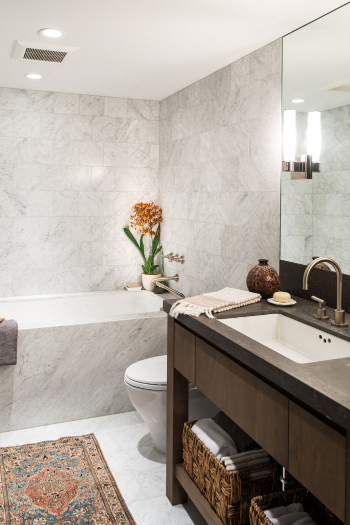
With no natural light into the master bath, floor-to-ceiling Carrera tile preserves a spa-like experience. By reconfiguring the master bath entry, a pass-through dressing area and a walk-in shower and soaking tub were able to be accommodated. In the guest bath, a private toilet and shower room allows the two girls to get ready at the same time. Flipping a small hall closet to the guest bath interior created a large linen cabinet for all bath and bedding needs.
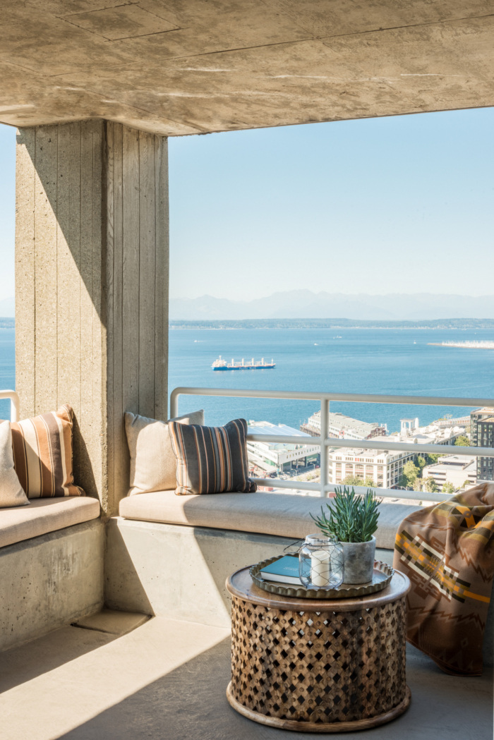
The living and kitchen areas have a decidedly more modern look to them, with cooler hues mixing with more rustic elements for a fresh take on urban living. Warm reds, yellows, and oranges on a cream backdrop make sure the colors shine through, while still allowing that stunning view to take center stage. The kitchen features a lighter mahogany on the cabinetry and ceiling, while the light gray base on the roomy island ensures that the natural wood doesn’t overwhelm the shared living spaces. Distinct kitchen and living areas are defined by dropped ceilings consisting of dark, rough boards, that conceal lighting and contrast with the original ceiling, making it appear higher than it is. The ceiling and window-facing vertical elements are white to intensify the daylight and distribute it deeper into the apartment. A small outdoor terrace provides direct access to the elements.
Design: Hoedemaker Pfeiffer
Builder: MLW General Contractor
Photography: Andrew Giammarco

