Old Soul Princes Hill House
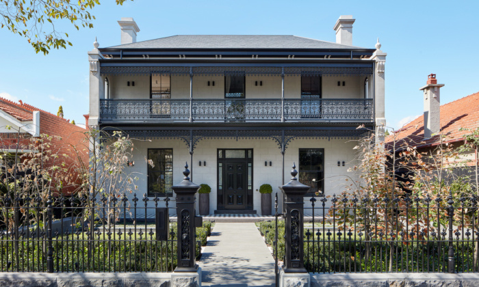
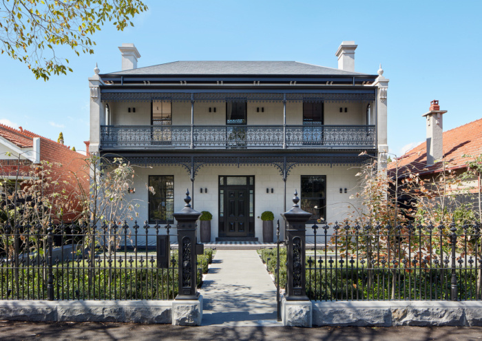
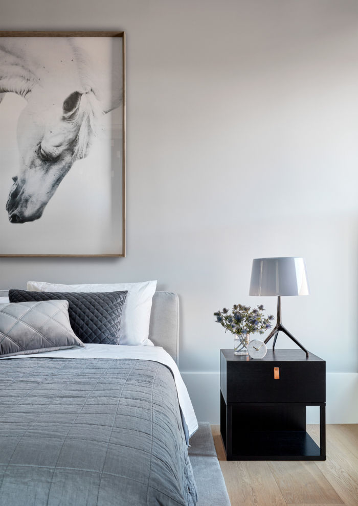
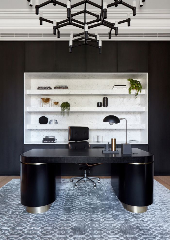
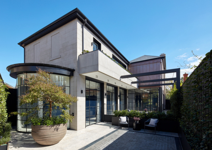
Celebrating the “old” in a modern context, Christopher Ellliott Design complemented a heritage Victorian house with a progressive and contemporary design located in Melbourne, Australia.
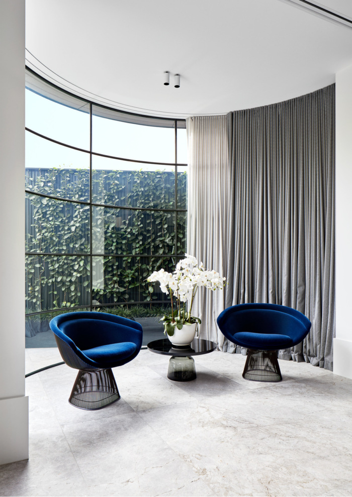
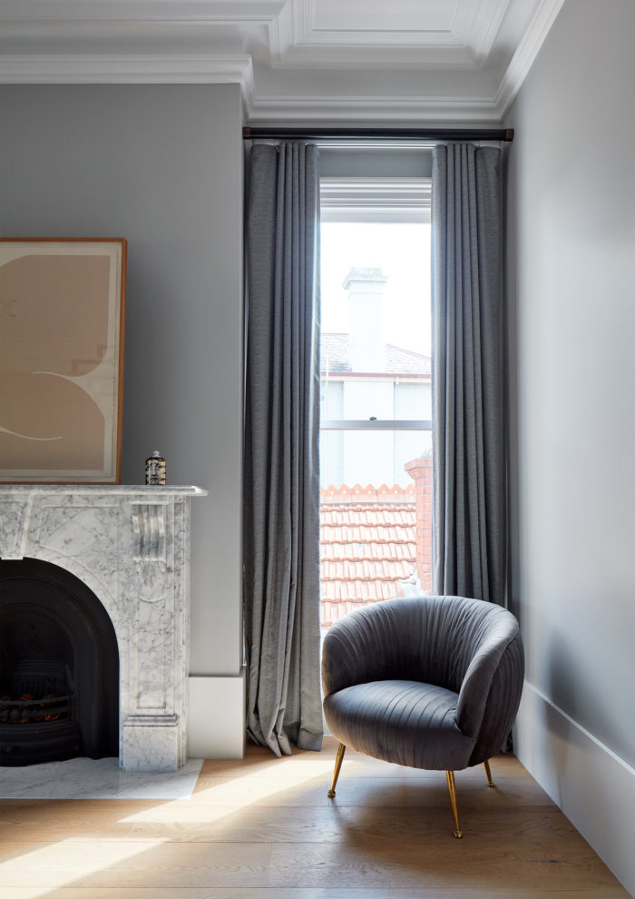
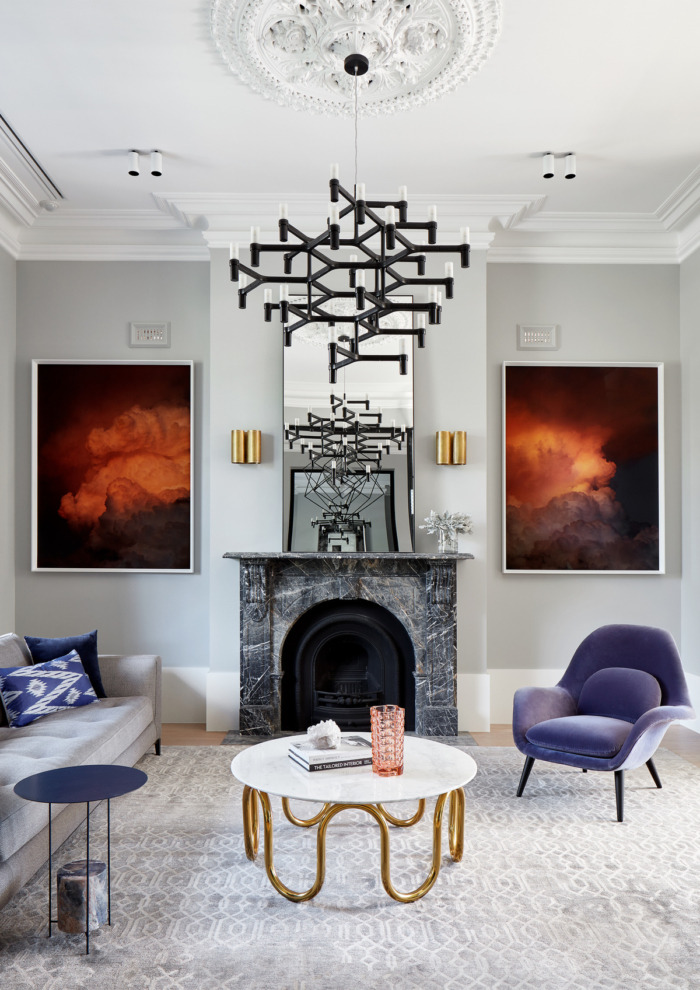
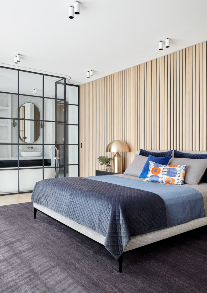
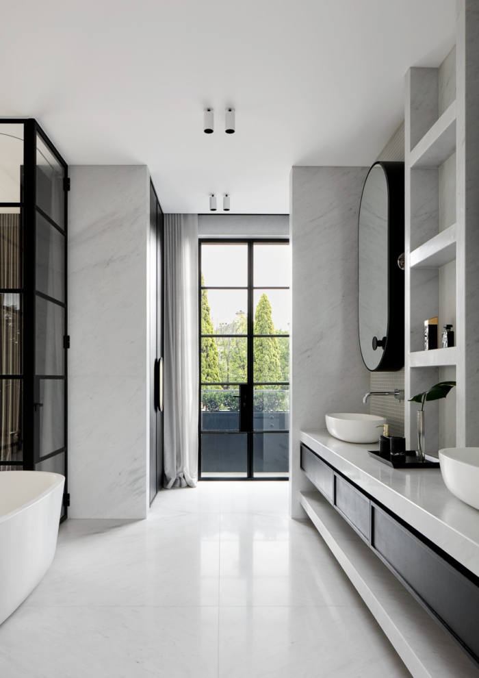
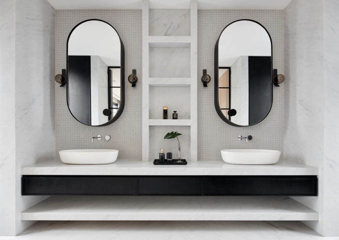
Normally, when working on a heritage listed project involving a grand double fronted Victorian house, the approach is conservative. But, thankfully the client had a brave attitude and allowed us to implement a progressive and contemporary design. We drew inspiration from Nordic inspired European interiors that celebrate the ‘old’ in a restrained modern context. The harmonious junction of the black steel glazing, against the sharp, clean architectural lines of the building exemplifies this beautifully.
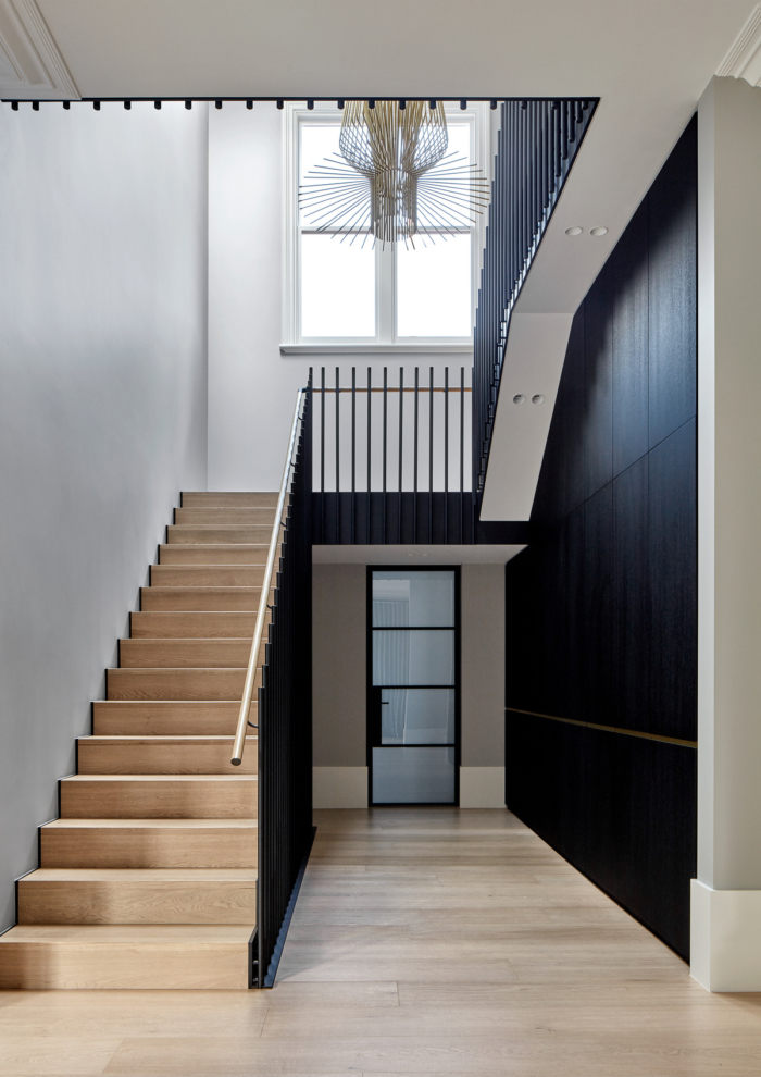
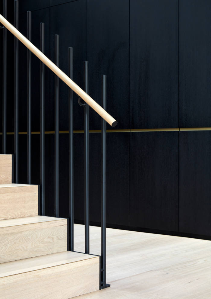
The original layout of the staircase was compromised by a powder room that intercepted it on the ground floor. We felt this configuration would be disastrous for the design of the staircase, which should be grand and commanding. There were other issues that we had to contend with; multiple ceiling heights in the main kitchen living space; general bathroom layouts; and marrying the new extension with the original architecture.
We proposed to relocate the powder room, making use of a narrow area between the existing property and the boundary, and in doing so, taking advantage of an existing opening. Simple in theory, but required the plans to be resubmitted to the council; a situation that no client likes when approval has already been granted. However, the result was worth the wait.
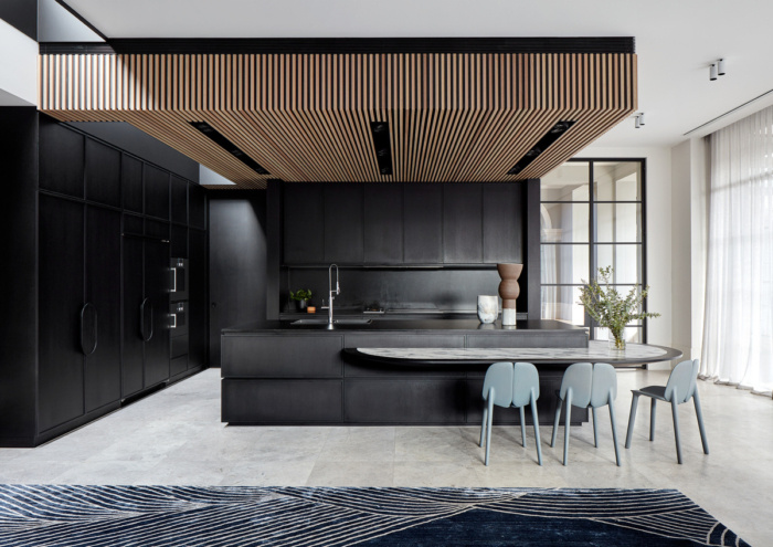
The varied ceiling heights in the kitchen were far more complex to resolve. Essentially, we had three heights to contend with. The full height of the main living space; the reduced height above the kitchen (accommodating the airconditioning) and an even further reduced height of the boundary wall. Our solution was to create a void behind the main bank of kitchen joinery, allowing us to run the joinery panels up to the kitchen bulkhead, concealing the further step-down. Coupled with this we chose to clad the bulkhead in timber slats; which brought a sense of purpose to the design.
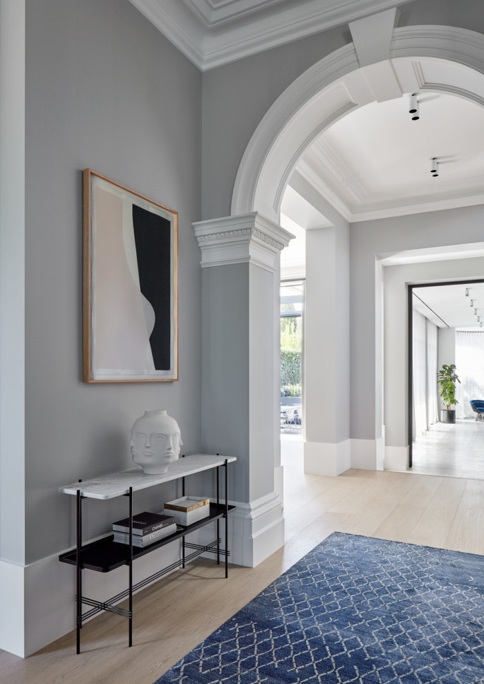
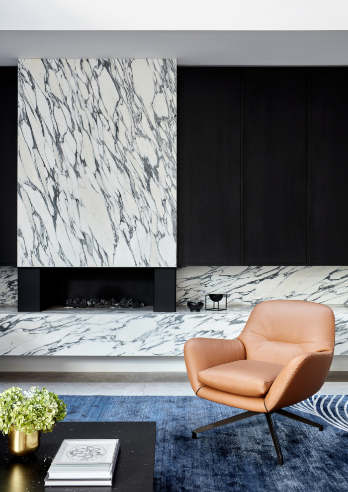
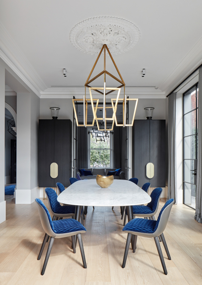
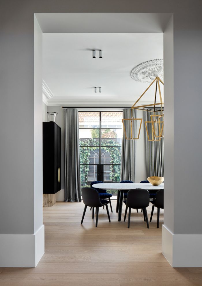
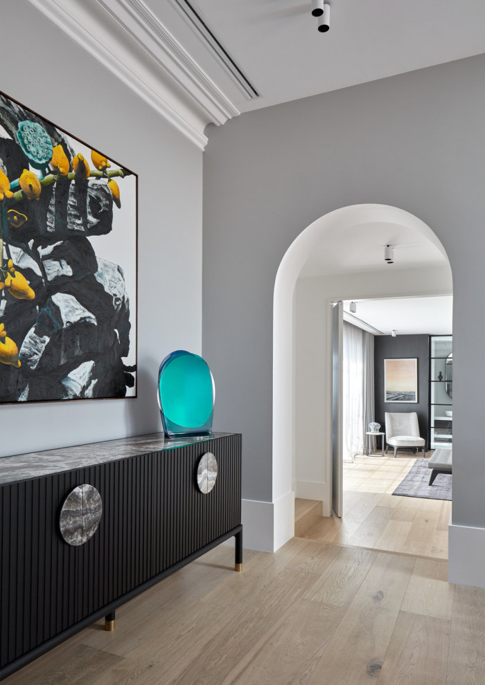
When it came to creating a design language that could transition between the original rooms of the house and the new extension, we sought to highlight the best of the period features and use materiality to harmonise the spaces.
Design: Christopher Ellliott Design
Landscape Architecture: Jack Merlo
Photography: Jack Lovel

