Kensington Gardens Apartment
Patalab Architecture reconfigured this London apartment to support maximum exposure to daylight with a new open concept better suited to fit the needs of a young family.
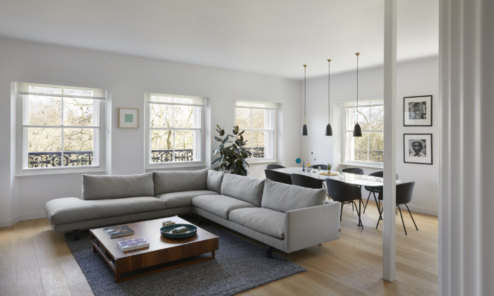
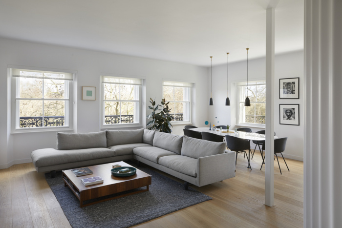
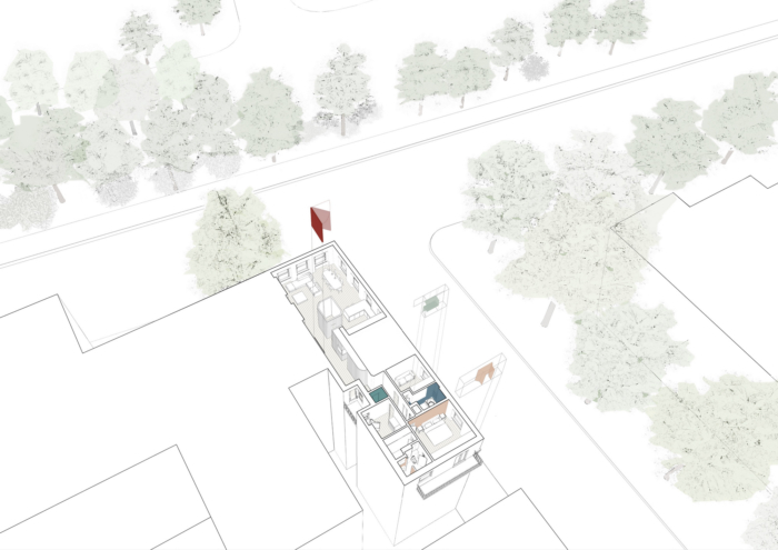
When visiting Kensington Gardens Apartment for the first time we were struck by the leaf-filled view benefiting the old-fashioned sitting room. To the north and east you could see trees extending down Kensington Road and across Kensington Gardens, the palace just hidden by the extensive greenery. A large London plane tree to the front of the property gave the front room a delightful tree-house quality as you looked into the crown of branches.
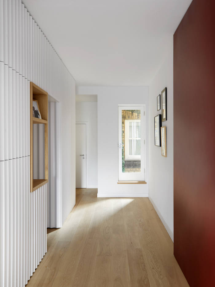
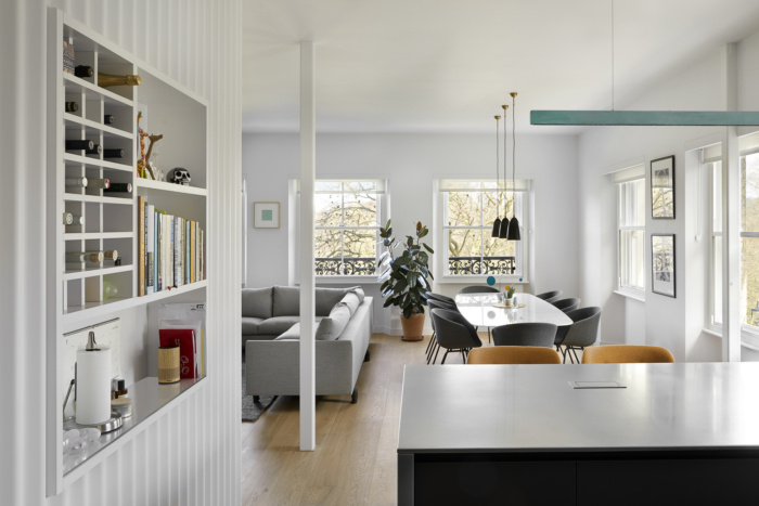
Liberating the view, we removed all internal partitions to this side of the apartment which not only allowed the living space and kitchen to enjoy the vantage across the park but also created a larger, light-filled space better suited to a young family. Further stripping out resulted in the reclamation of a hidden window (formerly concealed behind one of many internal walls) and the extension of floor to ceiling height throughout. To compliment this new openness we chose a pared-back palette – light oak flooring and white-painted walls and ceilings – and then injected moments of bright colour to emphasise the new airy composition. A new full height crimson pivot door feels like a piece of artwork in the hallway, it’s large scale and vibrant colour providing a statement in the entrance that reflects the generous proportions of its surroundings.
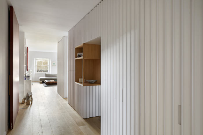
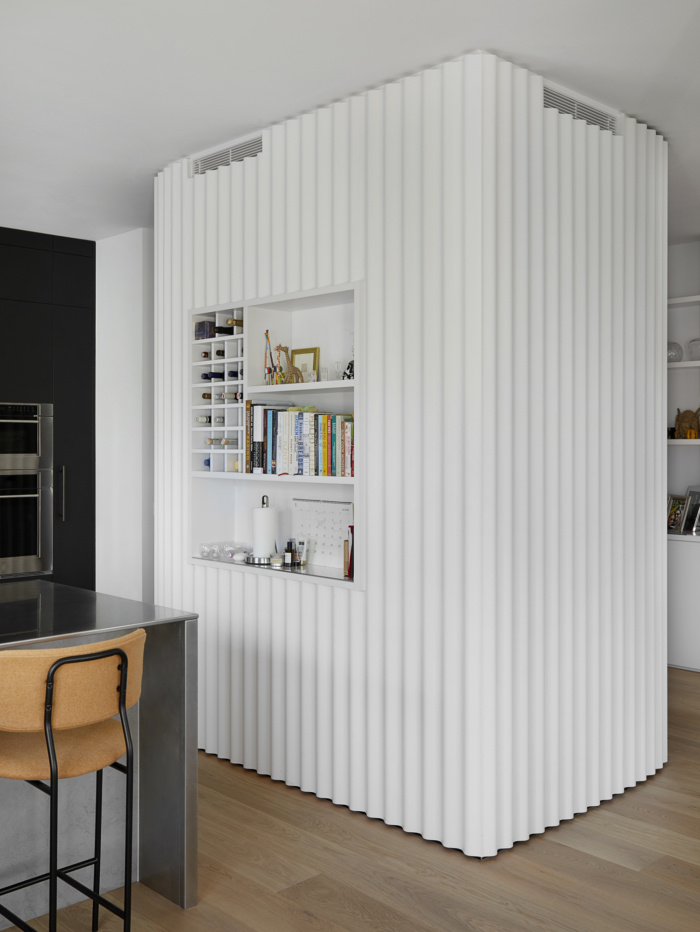
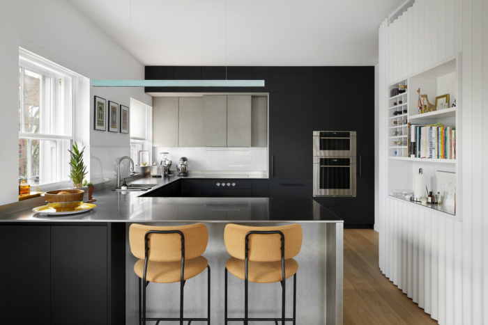
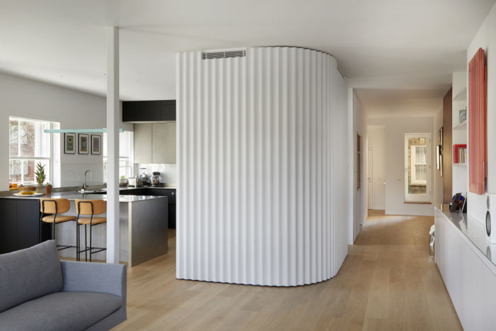
Installing joinery in the unusually wide hallway made the space feel more balanced and fulfilled the client’s brief for lots of storage. The wavy design evokes a curtain that is drawn to softly divide up the space but in reality conceals mechanical services, air-conditioning, a utility room ‘pod’ as well as storage. It introduces movement along its 8-metre length with punches through to the kitchen and front door making it feel inhabited. This inhabited curtain ties the public and private halves of the apartment together and forms a corner area for the kitchen to comfortably occupy.
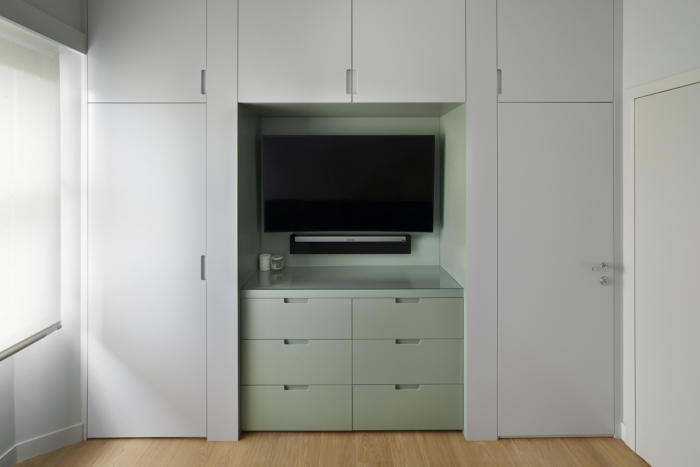
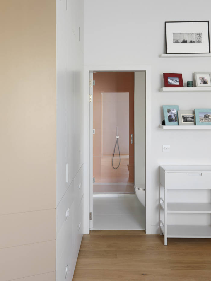
The joinery in the spare bedroom appears serene yet it works very hard – it discreetly conceals the air-con, a door to the bathroom and extensive storage. We introduced a central section with drawers and an open niche in a sage green colour. This gives the room a colourful focus as well as making the room feel a little bigger. The niche has removable shelving and so can be used as an open bookcase in the future.
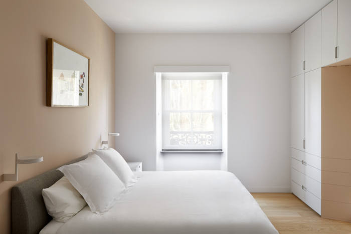
The master bedroom has a tranquil quality. We chose a harmonious accent colour, a warm and subtle blush, which is repeated behind the bed, within the joinery and again in the tiling in the shower area of the master en-suite. The joinery in the bedroom not only provides wardrobe space but also features a chamfered portal between the bedroom and balcony – its shape welcomes in light warmed by the pink hue lining the threshold, yet blackout and privacy blinds are recessed to enable as much or little of the outside in as desired.
The brief was a full refurbishment of a 3-bedroom apartment, creating a contemporary open plan living space and liberating the view from the apartment.
The key challenge was creating an open, contemporary yet warm and personal interior. And our solutions were: removal of walls, opening up previously concealed window, introduction of warm and natural material palette, and introducing colours.
This project is unique due to the choice of material combining wood, concrete, stainless steel and colourful tiles, introduction of a subtle colour palette to link spaces, and the finely detailed joinery.
Design: Patalab Architecture
Photography: Julian Abrams

