Landmark 81 Apartment
Dandelion Design Construction has successfully designed and constructed the interior of the Landmark 81 apartment that ensures the harmony, full of uses, and expresses the personality of the landlady.
The client is a special customer, with a high standard of living and aesthetics. She often travels to Europe, so she loves the gentleness and sophistication in European living space.
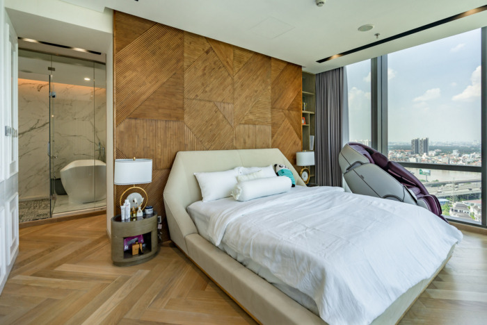
Dandelion said yes to design her house before handing over about four or five months. The layout did not satisfy her. She wanted a large dining room and a master bedroom as well. However, the structure of the building is made of non-demolition reinforced concrete walls. Therefore, we only can allocate the space within the permissible limits.
The problem is to create a space that is not only logical but also makes people feel good to enjoy. The style is modern but must be charming at the same time.
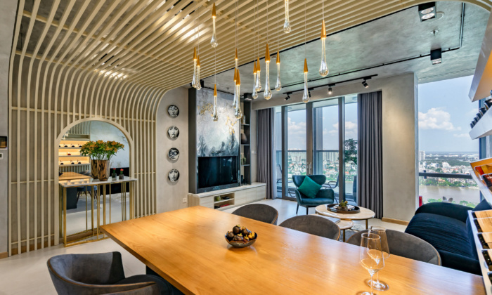
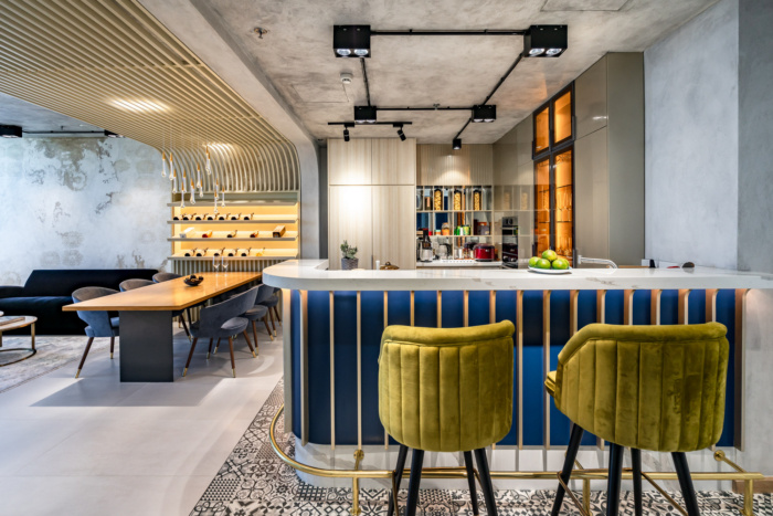
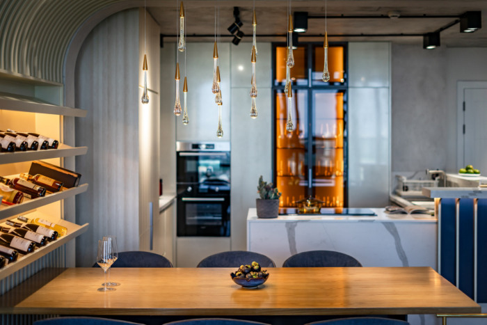
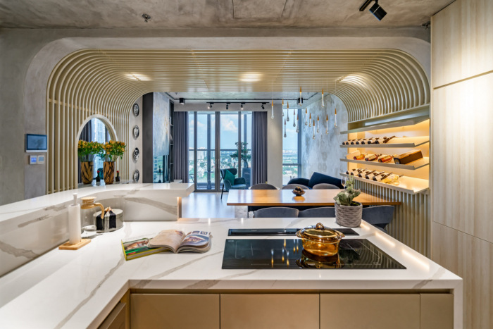
Firstly with the kitchen space and the dining table. We turned the kitchen to the outside facing the balcony door, from there the landlady can see the beautiful view of Landmark 81 below. There was a bar next to it.
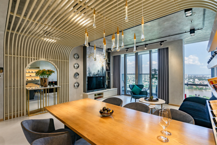
The landlady said that she wanted the dining space to be separated and make her feel like being in a restaurant. We decided to create a highlight on the ceiling of the dining table with the light bars shaped like water droplets across the bar connecting from the background to the ceiling, which is very charming and has a sense of personal space and a highlight for the whole room.
The living room is shared with the dining area and the kitchen so the living room does not have the feeling of a normal living room but a relaxed space with a dining space.
Choosing furniture for this area, the landlady was also very strict and wanted everything to be perfect, we proposed the appropriate brands and models for her to decide for herself. In addition to beauty and quality, the furniture must be very comfortable to use.
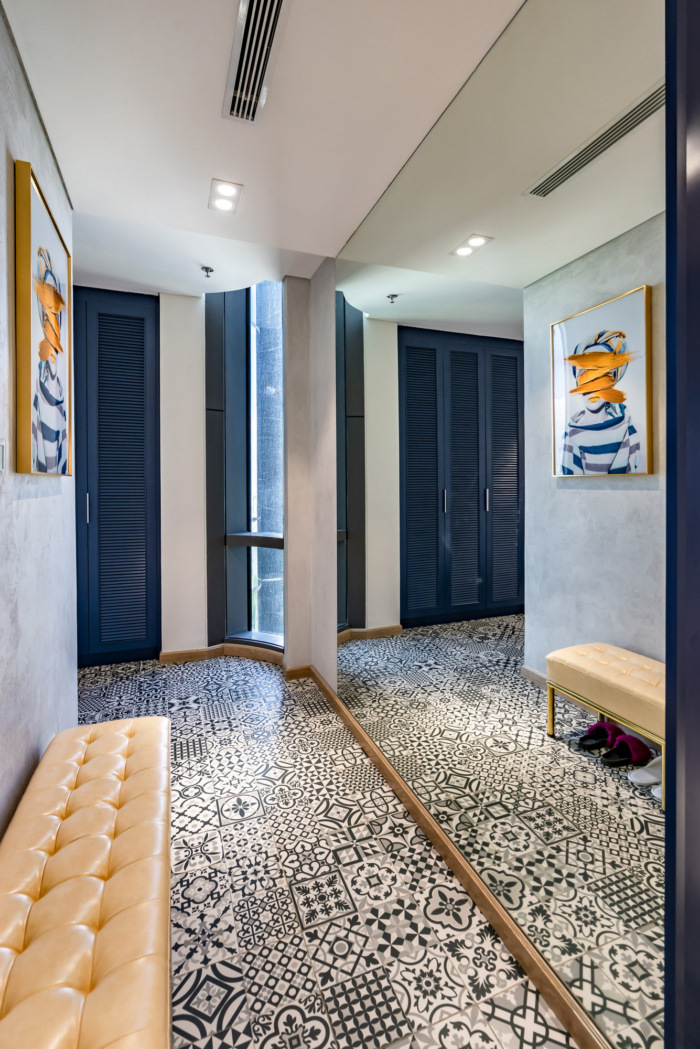
There is a long corridor leading to the bedrooms. In order not to have the feeling of being too long and narrow for it, we used a large piece of glass along with a shoe changing chair and a shoe cabinet in the corridor. Not only has a sense of narrowing and has a useful function.
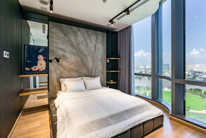
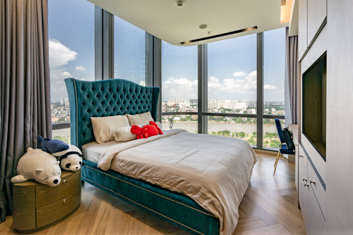
In terms of color, the landlord especially loves navy blue. So we used that color to create accent colors indoors. The house does not have many colors: white, light yellow, gray concrete, black with wood, and blue accents. The house ensures harmony, full use and expresses the personality of the landlady is the success of this design project.
Design: Dandelion Design Construction
Photography: Trang Chù

