Mondrian’s Window House
Form4 Architecture were engaged by two artists to design an extension for their San Francisco home that draws on the architecture of linearity and sequence.
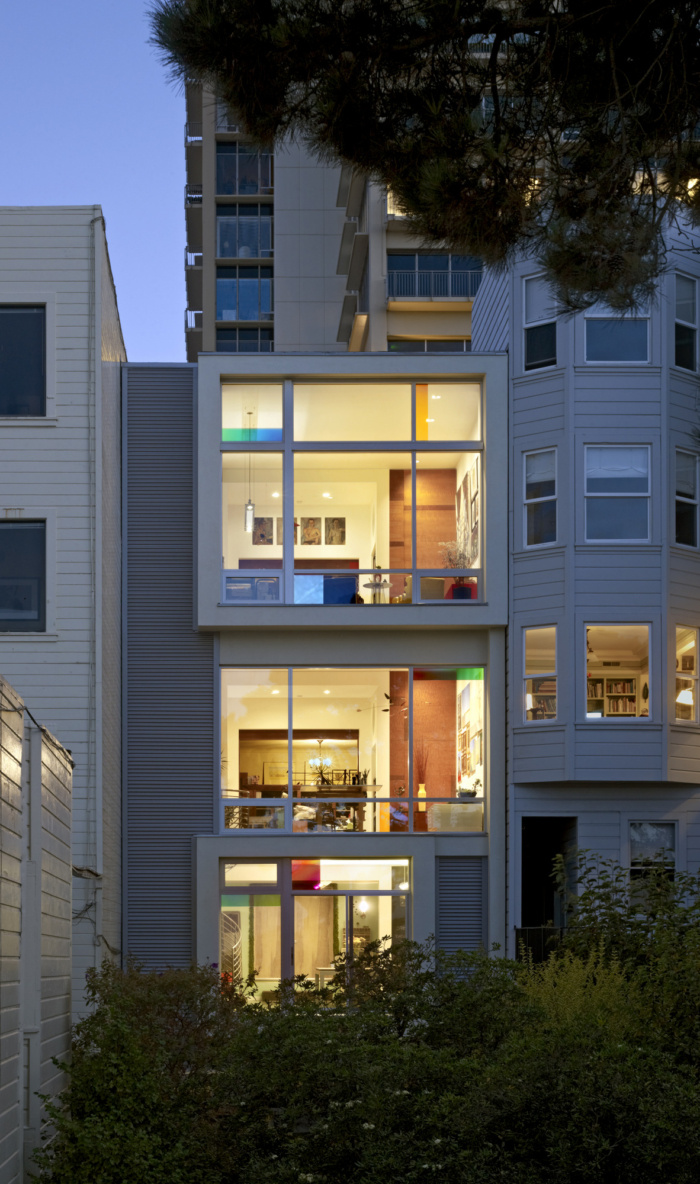
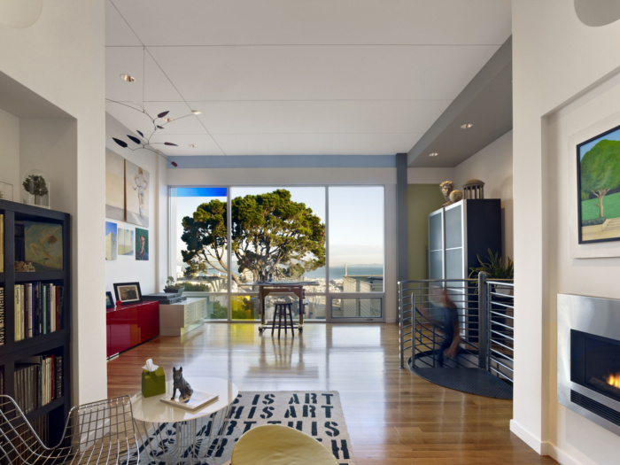
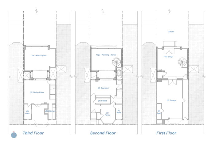
Designed for two artists—one also the architect—this rear addition to a one‐bedroom house symbolizes architecture of linearity and sequence, where all of the rooms across the three stories have a sightline, progressively more expansive as one moves higher, overlooking a downward sloping garden and panoramas of the Bay to the North.
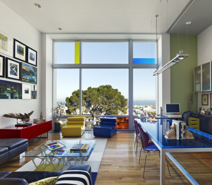
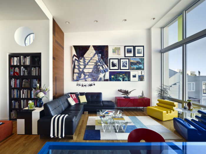
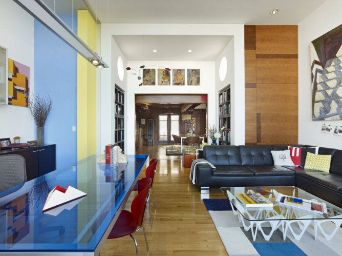
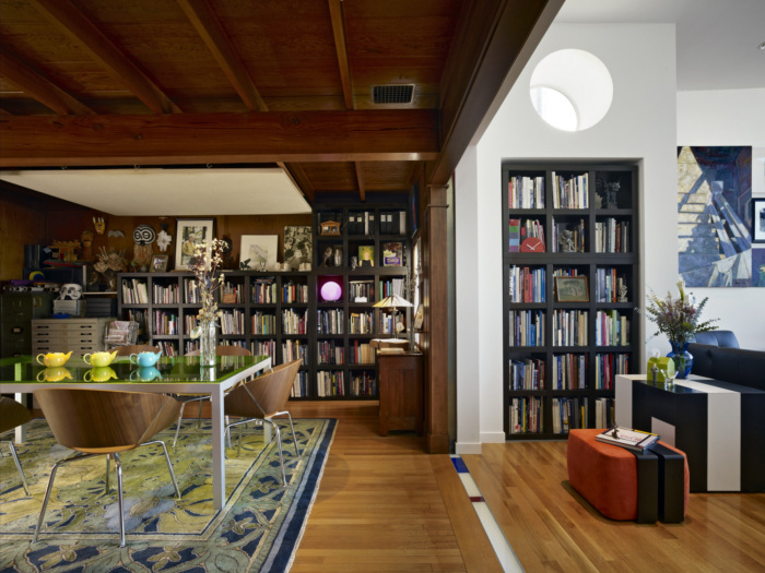
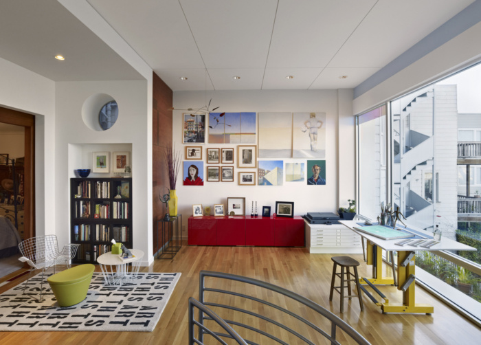
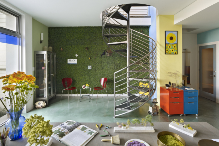
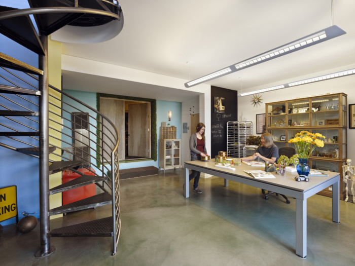
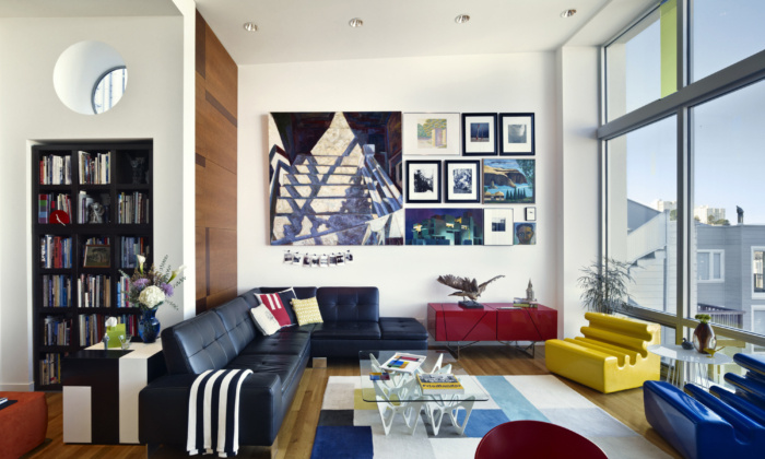
At the ground level, the existing garage opens onto a new studio that opens onto the garden beyond. Connected by a spiral staircase in the studio, the second level comprises an existing street‐facing parlor and previously windowless bedroom, which now opens onto a multi‐use space for painting and yoga. The existing kitchen and dining room on the third floor open onto a live/work space that also doubles as an area in which to entertain. The view of the Bay increases as one ascends.
Built on a lot narrower than the typical San Francisco 25‐foot parcel, this three‐story infill project is not visible from the street. Instead, the existing 1,900‐square‐foot residence forms the primary façade of the new 1,400‐square‐foot addition.
The addition to the house opens up the space to provide room for creative work and an abundance of natural light. The original spaces gain more breathing room while continuing to cater to everyday functions. These areas were kept in the Edwardian/Arts and Crafts style in deference to two generations of artists who lived in the house prior to the current owners.
The rear elevation, now the primary façade of the house, is rich in explicit formal references. They range from the Dutch cabinet maker/architect Gerrit Rietveld for volumetric composition, to Dutch painter Piet Mondrian for the subdivision of the glazing and its coloring, and contemporary New York architect Richard Meier for the expression of frames containing the individual windows in and out of the primary building envelope.
Through a language of planes, a much larger scale is hinted at than what the current footprint really affords. In breaking down the smaller elements, blatant symmetry is avoided, while simultaneously remaining elusive. As a result, there is some symmetry in the middle floor, wherein the sectional ins and outs activate the default flatness of the elevation. Selective use of dichroic glass suggests further scale as a pursuit of optical vibrancy. These bold primary colors are repeated in the two main worktables’ bright colored‐glass tabletops. The wall surface is broken up into planes in the color palette of the California morning.
Design: Form4 Architecture
Photography: Bruce Damonte