Long Brick House
Bradley Van Der Straeten worked to create a smart solution in an extension that seamlessly integrates the old and new of the Long Brick House in London.
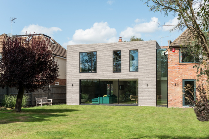
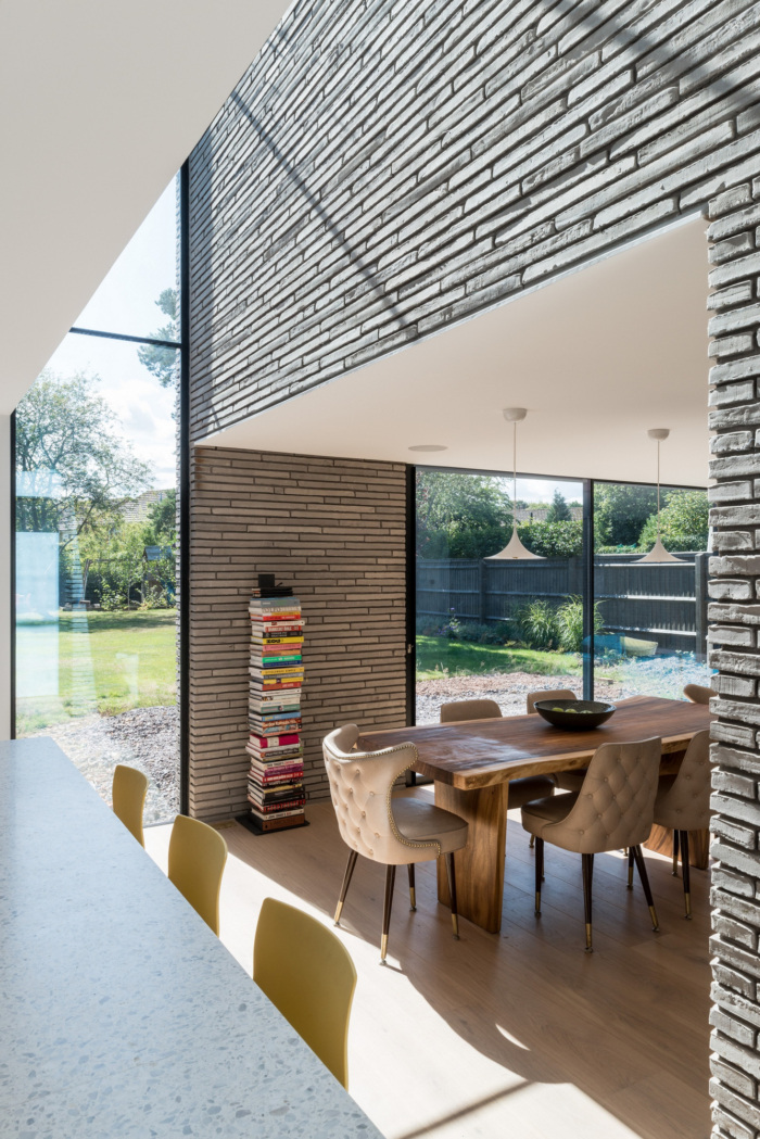
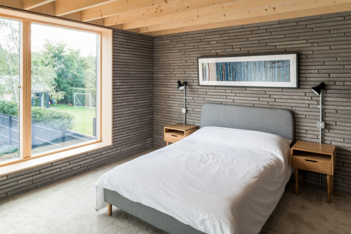
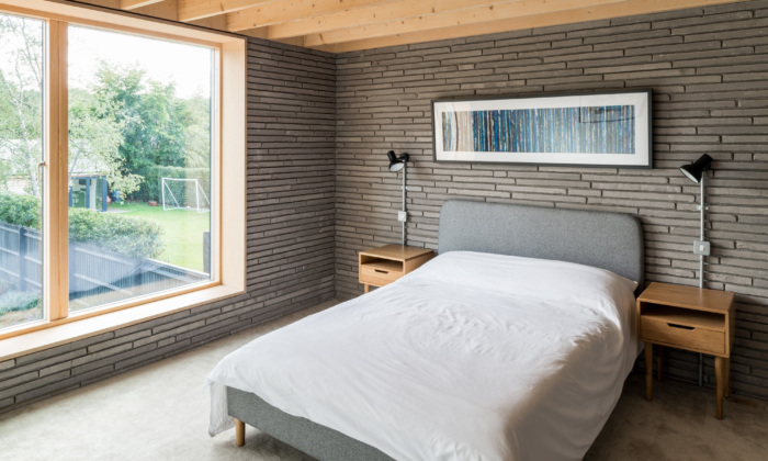
Beautiful long grey bricks clad the double-story extension to this property near the Chilterns in Seer Green. The extension forms a new volume externally while merging old and new spaces internally.
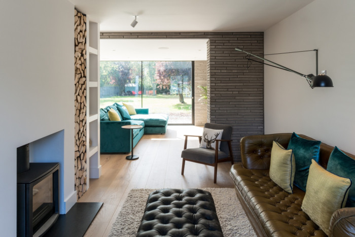
Approaching Long Brick House, you would not have the slightest idea that behind a standard door lies a home that beams with natural sunlight and clever design ideas. The existing dis-jointed house had endured multiple conversions, over time it had become a house full of small spaces and no cohesion. It lacked a key focus, a place where a family could spend time together. The house seemed to almost reject the beautiful garden. The easy solution was to knock down the house and rebuild it. The smart solution was to transform.
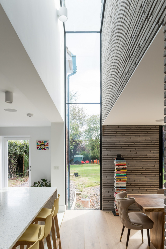
Our aim was to make sure the house addressed its local environment whilst achieving something very different and unique. The solution is a two-story box that sits on the back of the existing building with a ‘canyon of light’ separating old from new.
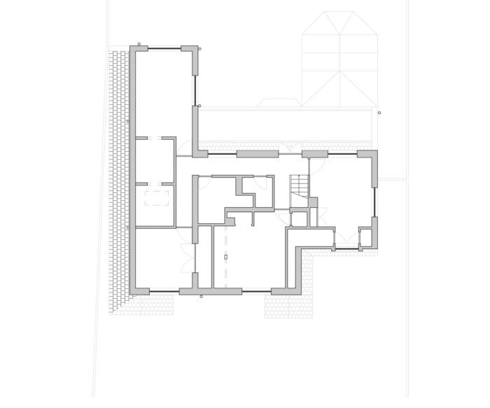
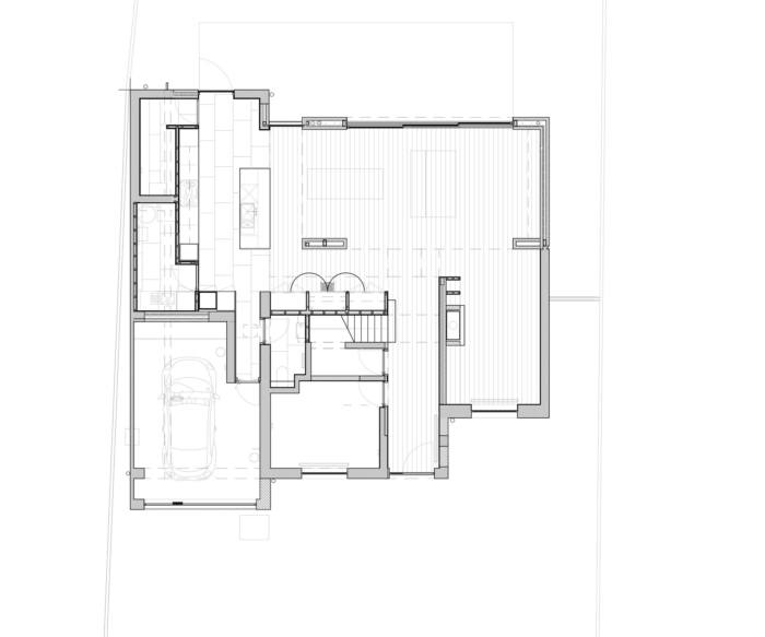
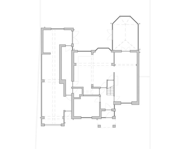
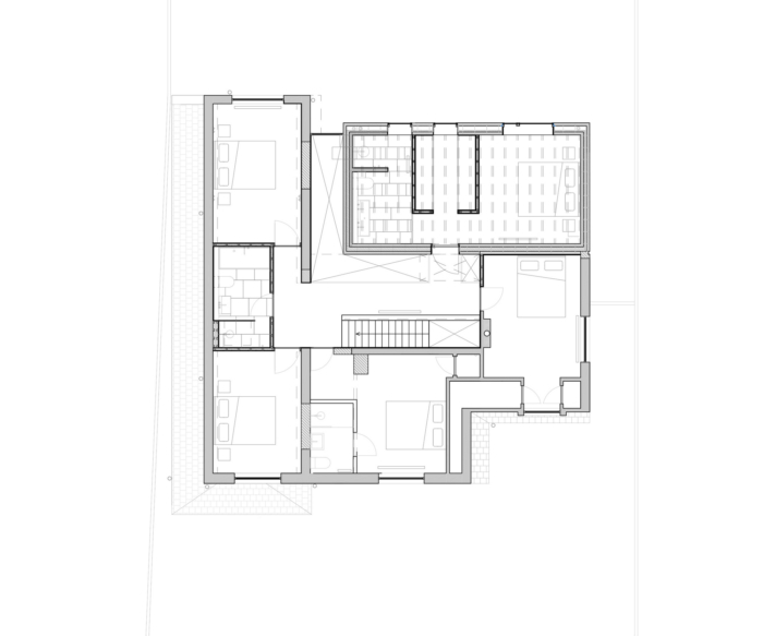
The brief was to provide more bedrooms to the existing property and to create open-plan living spaces suitable for family life. The existing property was disjointed. It had been transformed many times over the years, resulting in a large property that had no cohesion, a lack of daylight and very small circulation areas. The challenge was to transform the property with a relatively small budget.
The solution was to keep as much of the existing property as possible and build a simple and separate structure to create the new spaces. This kept the cost of construction relatively low and created a very strong concept to guide the design and the choice of materials.
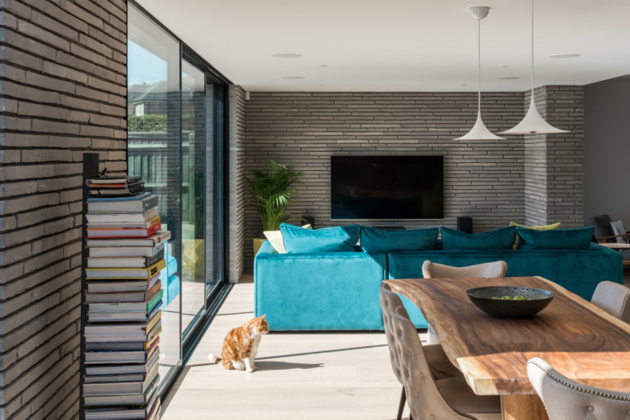
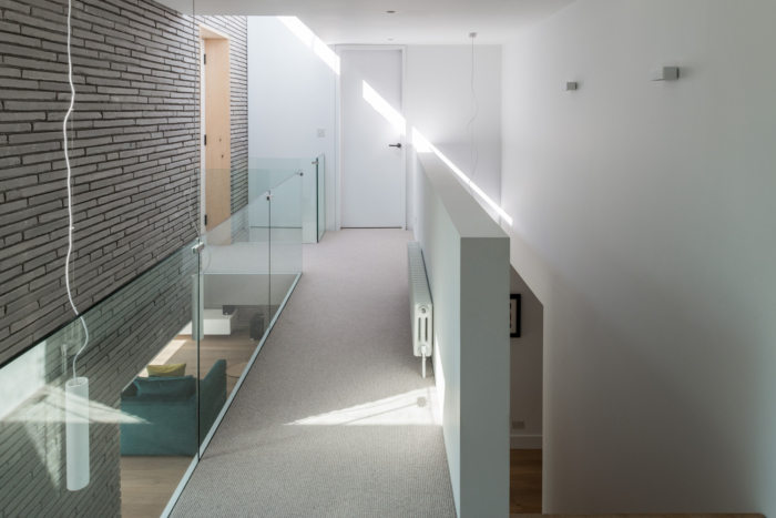
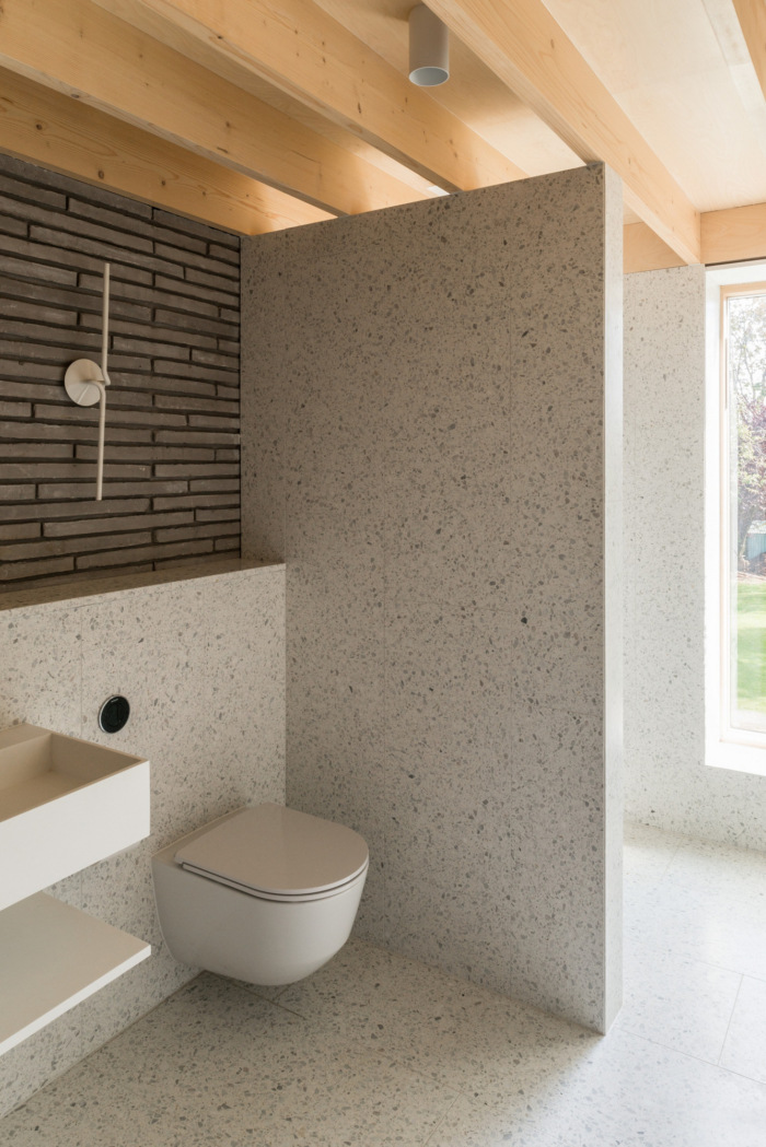
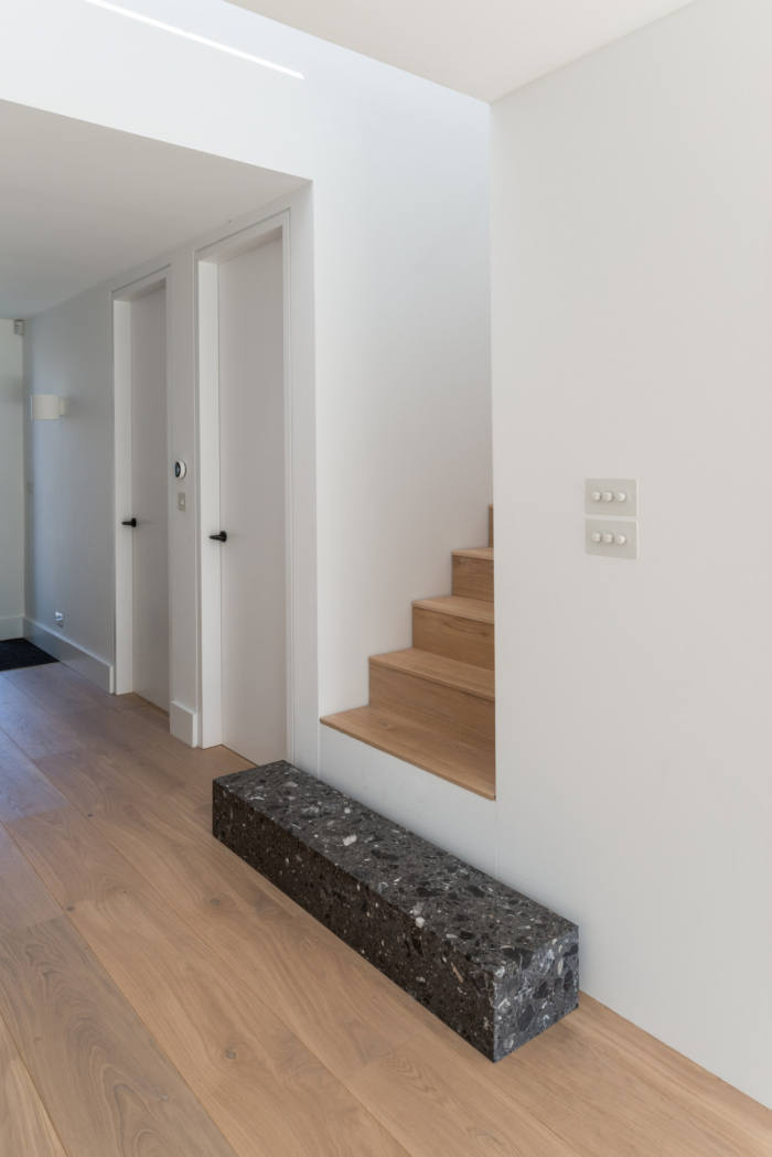
The Roman long bricks which have been used throughout the build provide contrast to the old building but still appease its local surroundings. To be able to use the bricks outside and inside the building gave us the ability to clearly define the new build with four distinct pillars. These pillars, while being aesthetically pleasing give you orientating point while moving through the building.
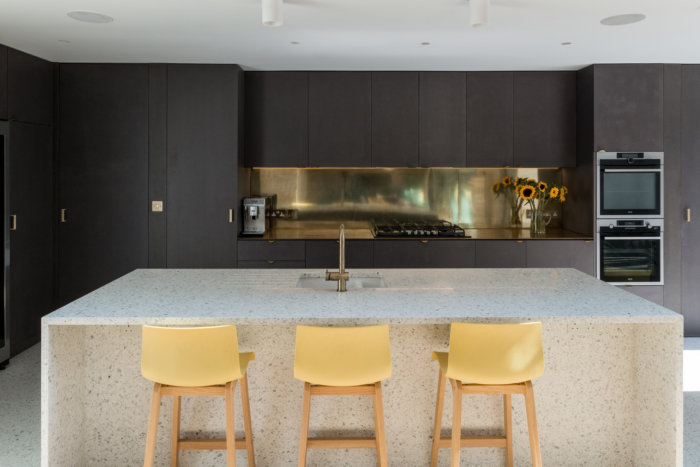
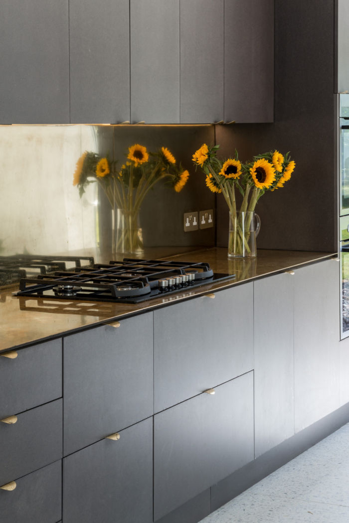
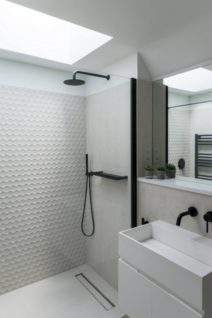
Clever storage space can be found throughout the house. By simply moving the kitchen forward from the sidewall we created a space for a walk-in larder and a utility room. Using hidden doors, the kitchen feels bigger than before but using less space. The client and their family were a sporting bunch, so having room for all the equipment was important to them. Using the space under the walkway on the first floor we were able to build in huge amounts of storage to house all their requirements. Moving upstairs, there are subtle changes that have allowed for more bathrooms and cupboard space throughout all the rooms.
Design: Bradley Van Der Straeten
Photography: French & Tye