Feng Shui House
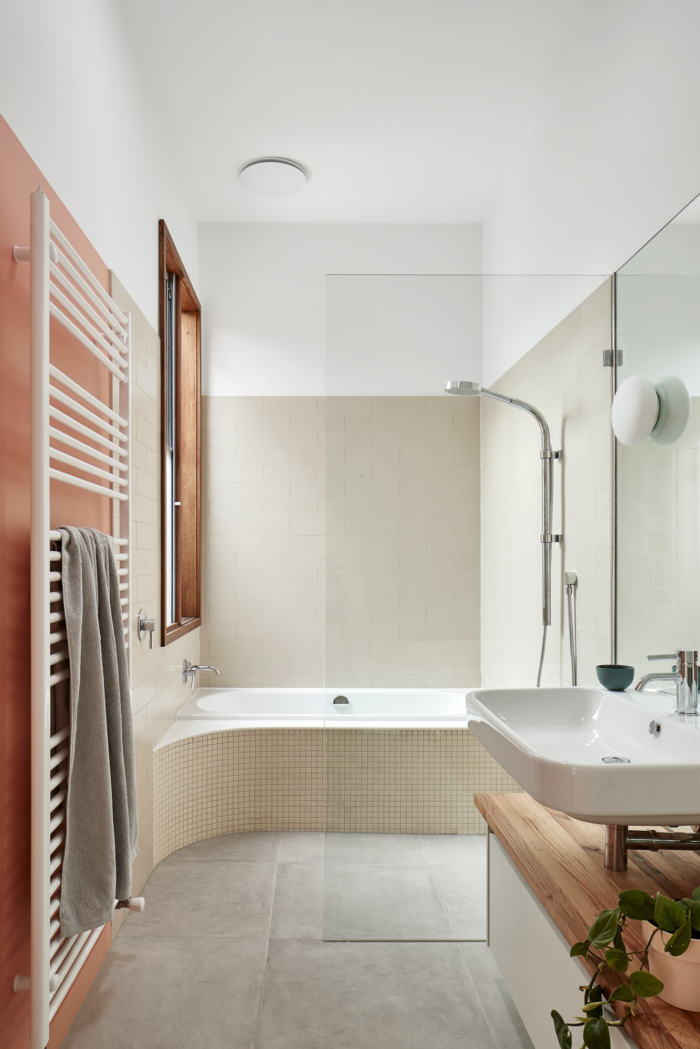
The Feng Shui House honors its namesake with a creatively designed space that integrates with its surrounding environment in Melbourne, Australia.
The practice of Feng Shui finds its origins in China, going back about 6,000 years. It literally translates to “wind and water” and is a concept aiming to design and plan buildings and their surroundings for harmony and happiness.
Feng Shui calls on you to organize objects to allow for the flow of what is referred to as natural energy seen as moving through a space and all living things. In this context it is understood that a building’s layout, colors and materials affect the flow of energy. Feng Sui design applies three core principles: allow energy to flow, balance between natural elements with their own sets of attributes including color, texture and shape, and place objects that represent your life’s journey within a space.
To a Westerner only vaguely familiar with some of the specific theories and ideas, there is a surprising correlation between Feng Shui and what we would call “good design”: sun light access, air and ventilation, balance of natural light, equal relationship between inside and out, comfort and privacy, balance of materials, a well organized environment.
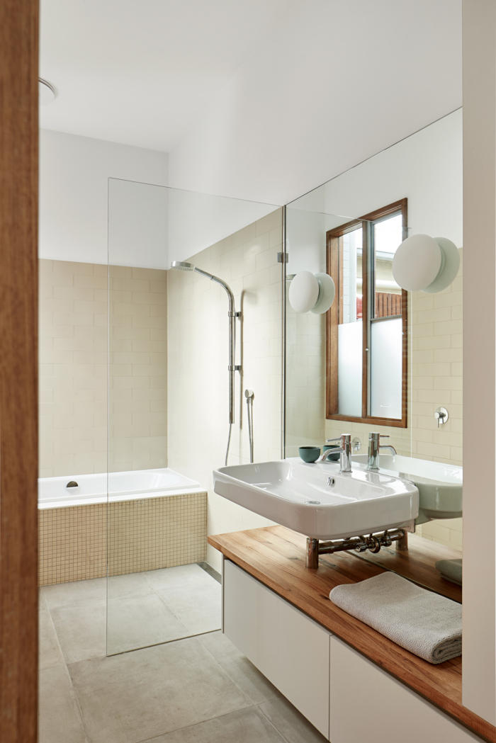
Plan and images of this home make the brief self-explanatory, so let’s talk about our design decisions, a series of small and considered moves based on the study of Feng-Shui principles.
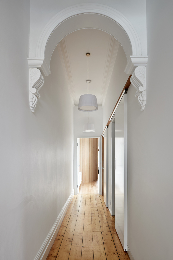
The old terrace was restored, a new curved timber wall at the end of the hallway works as both a link between old and new and a barrier to the street.
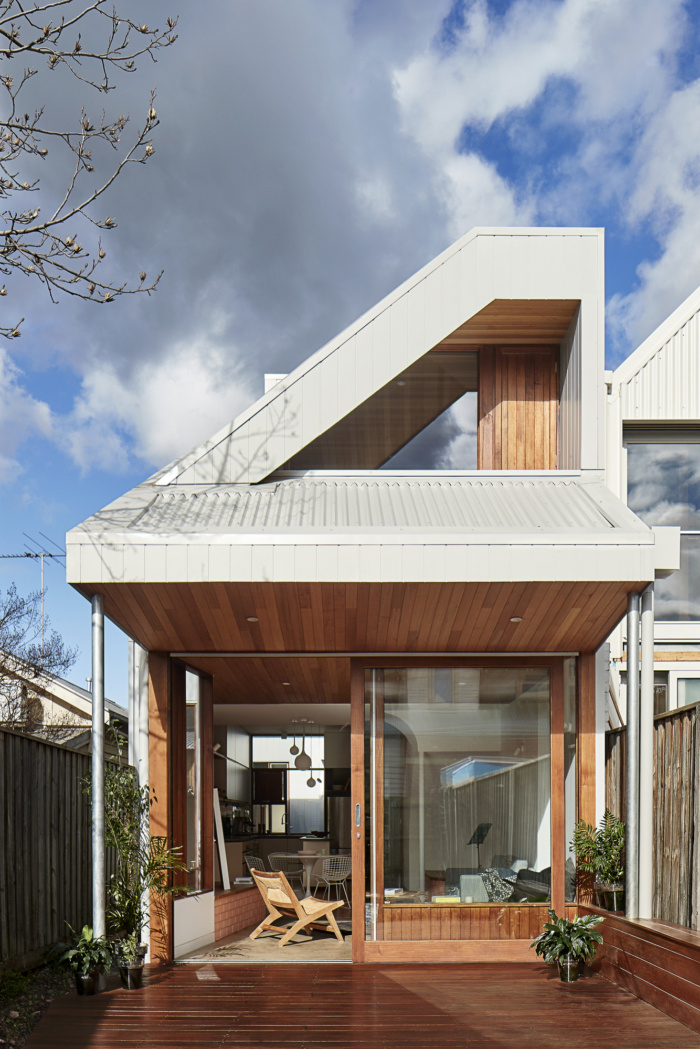
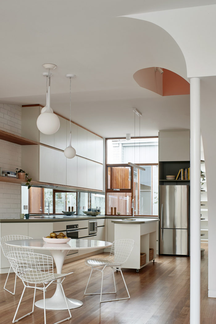
The extension is separated with a courtyard for sunlight into the old, and natural light and ventilation into the new house. The hall linking terrace with extension was widened for a study with outdoor access. The curved timber wall, enclosing a store, leads into the kitchen planned to greet visitors at arrival and overlooking courtyard and study.
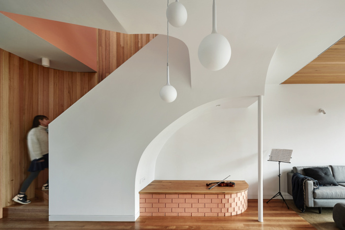
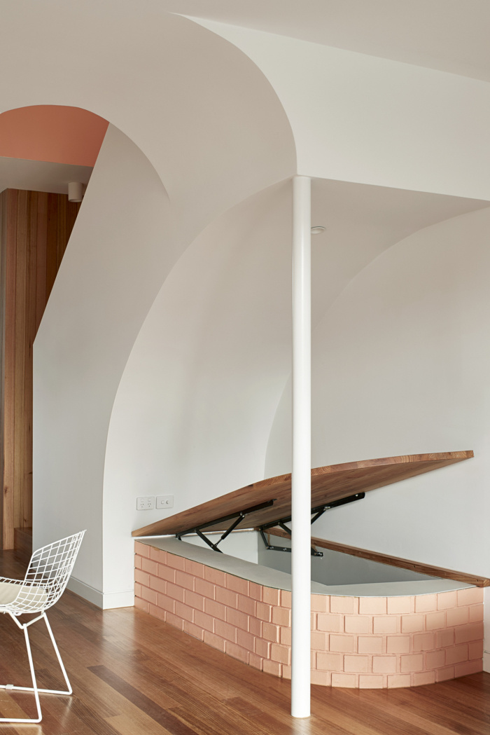
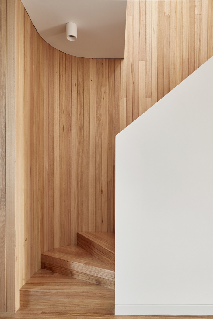
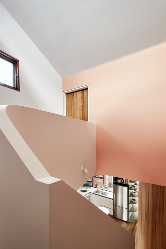
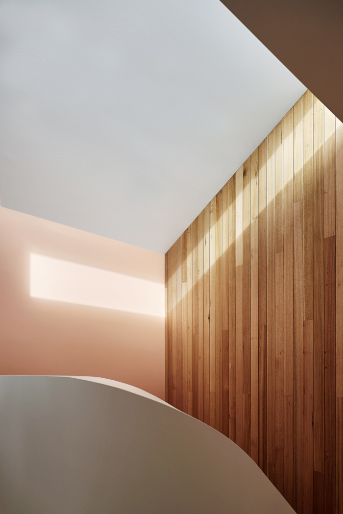
Behind the store a stair void appears. The back is colored reflecting light into the space below. Color and materials only reveal themselves gradually, a design move often by Mexican architect Louis Barragan and one of my favorites.
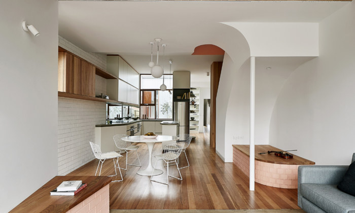
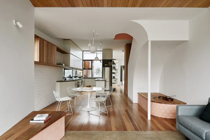
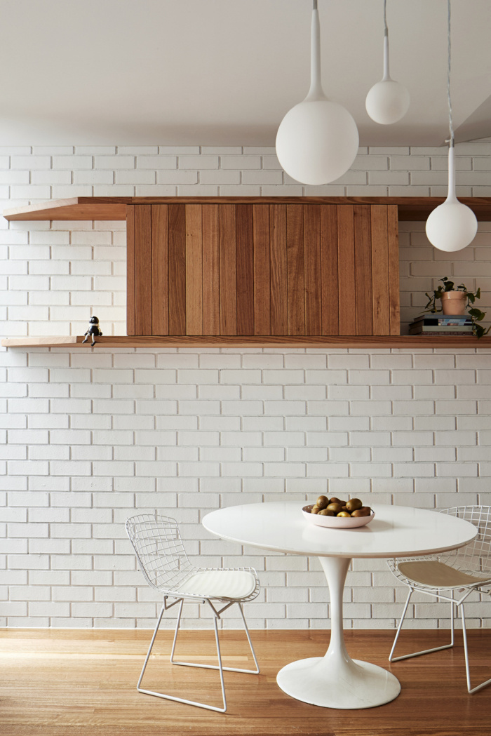
Between stair and kitchen, we placed the dining room, a busy, engaging and open space, designed to encourage conversation.
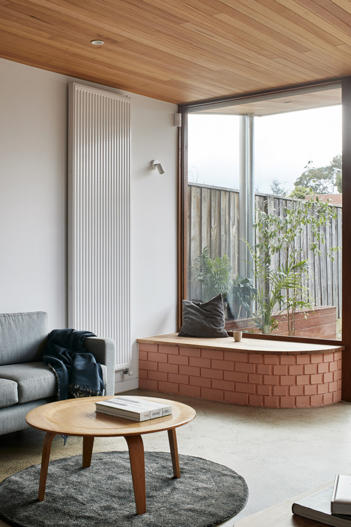
The timber floor of the dining continues into the ceiling of the adjacent lounge, a retreat with a sense of calmness looking back into house, courtyard and out into the garden.
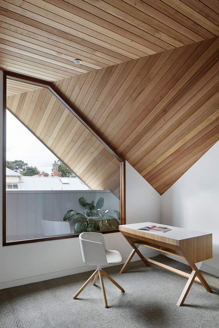
The upstairs rooms, more exposed to sun, wind and rain are formed and finished to achieve a balance between shelter from elements and exploring views into the distance.
The best form of interaction is the coincidental and the skill lies in planning the coincidence. Some layout and design decisions were made for this purpose evident in the brick platforms for seats facing dining space or lounge to allow for interaction.
For an economic house on a narrow block a compact footprint seems logical. However, logical is not always best. The lounge room walls were skewed and stretched, drawing sunlight and garden into the dining room. The stairwell itself forms a large void prioritizing space over utilities. It appears oversized. However, the benefits are obvious: elevated beyond providing access, the stair creates a light filled and generous living space on a small footprint.
Like any building project, the Feng Shui house aims to balance user needs with cost, both financial and environmental. To build climate conscious requires building less, and in order to be accepted we need to build better qualities with lesser means. We trust this has been achieved by applying principles of balance, meticulous planning and playing with space and scale.
Design: Steffen Welsch Architects
Photography: Shannon McGrath

